Wind and Storm Surge Use Cases
Field Sensing Wind Events
Wind Data Analysis Tools
Soundarya Sridhar - Florida Institute of Technology
Jean-Paul Pinelli - Florida Institute of Technology
M.A. Ajaz - Florida Institute of Technology
Key Words: wireless sensors network, Tapis, Plotly, and Hurricane Ian
Florida Tech (FIT) teams deploy networks of wireless sensors on residential houses during high impact wind events or on full scale wind tunnel models. Each deployment might include pressure, temperature and humidity sensors alongside different anemometers and a conical scanning infrared LIDAR. Figure 1 describes the workflow, which starts with uploading the data to DesignSafe through authentication tokens created in Tapis. Once on DesignSafe, three Jupyter notebooks process and visualize the instruments data for analyses. The notebooks provide a user friendly and interactive environment that can adapt to different datasets. For this project, the notebooks perform quasi static real-time analysis, assess sensor performance, and study pressure variations for different wind conditions and data correlation. The user interactivity of these notebooks facilitates an easy adaptation to different datasets with little to no-change in code.
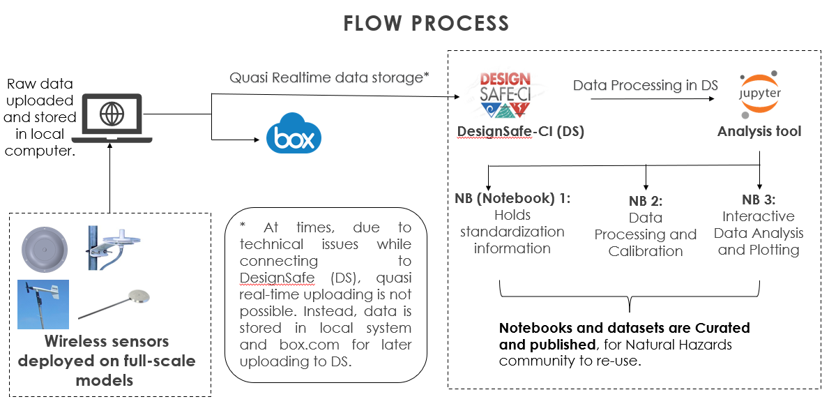
Figure 1. Workflow
Resources
Jupyter Notebooks
The following Jupyter notebooks are available to facilitate the analysis of each case. They are described in details in this section. You can access and run them directly on DesignSafe by clicking on the "Open in DesignSafe" button.
Jupyter Notebooks for WOW Sliding Patio Doors
| Scope | Notebook |
|---|---|
| Metadata Collection Setup | WOW_6-22-21_NB1__Standardization File.ipynb |
| Data Integration and Cleanup | WoW_6-22-21_NB2_WSNS POST PROCESSING.ipynb |
| WoW Test for Glass Sliding Doors, JUNE 2021 | WoW_6-22-21_NB3_INTERACTIVE ANALYSIS.ipynb |
Jupyter Notebooks for WOW Storm Shield
| Scope | Notebook |
|---|---|
| Metadata Collection Setup | WOW_8-10-21_NB1__Standardization File.ipynb |
| Data Integration and Cleanup | WoW_8-10-21_NB2_WSNS POST PROCESSING.ipynb |
| WoW Test for Storm Shield, AUG 10, 2021 | WoW_8-10-21_NB3_INTERACTIVE ANALYSIS.ipynb |
DesignSafe Resources
The following DesignSafe resources were used in developing this use case.
- Jupyter notebooks on DS Juypterhub
- Subramanian, C., J. Pinelli, S. Lazarus, J. Zhang, S. Sridhar, H. Besing, A. Lebbar, (2023) "Wireless Sensor Network System Deployment During Hurricane Ian, Satellite Beach, FL, September 2022", in Hurricane IAN Data from Wireless Pressure Sensor Network and LiDAR. DesignSafe-CI. https://doi.org/10.17603/ds2-mshp-5q65
- Video Tutorial (Timestamps - 28:01 to 35:04): https://youtu.be/C2McrpQ8XmI?t=1678
Background
Citation and Licensing
-
Please cite Subramanian et al. (2022), Pinelli et al. (2022), J. Wang et al. (2021) and S. Sridhar et al. (2021) to acknowledge the use of any resources from this use case.
-
Please cite Rathje et al. (2017) to acknowledge the use of DesignSafe resources.
-
This software is distributed under the GNU General Public License.
Description
Implementaton
Quasi-real time Data Upload with Tapis
The user needs a DesignSafe-CI (DS) account. During deployment, data is uploaded to DS in user defined time interval. Tapis CLI and Python 3 executable enable this feature and must be installed on the local system. The user initiates Tapis before every deployment through Windows PowerShell and Tapis creates a token as described below:
Video Tutorial (Timestamps - 28:01 to 35:04): https://www.youtube.com/watch?v=C2McrpQ8XmI
User Guide
- Turn on Windows Power Shell and enter the command tapis auth init -interactive.
- Enter designsafe for the tenant name.
- Enter the DesignSafe username and password of the authorized user.
- Choose to set up Container registry access and Git server access or skip this step by pressing the return key.
- Create a token using the command tapis auth tokens create. At the end, the response will appear on the cmd line as shown in Figure 2
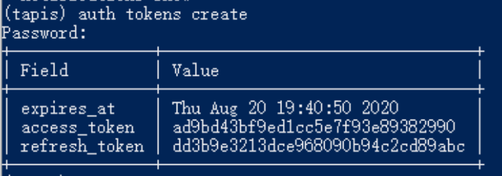
Figure 2.
Using Jupyter Notebooks
Instructions
Using JupyterHub on DesignSafe
Accessing JupyterHub
Navigate to the JupyterHub: Use this link to go directly to the JupyterHub portal on DesignSafe. Sign In: You must have a TACC (Texas Advanced Computing Center) account to access the resources. If you do not have an account, you can register here. Access the Notebook: Once signed in, you can access and interact with the Jupyter notebooks available on your account. To run this Project, you must copy it to your MyData directory to make it write-able as it is read only in NHERI- published directory. Use your favorite way to lunch a Jupyter Notebook and then open the FirstMap.ipynb file.
-
Run the following command cell to copy the project to your MyData or change path to wherever you want to copy it to: after opening this Notebook in MyData you don't have to run the below cell again !umask 0022; cp -r/home/jupyter/NHERI-Published/PRJ-4535v2 /home/jupyter/MyData/PRJ-4535; chmod -R u+rw /home/jupyter/MyData/PRJ-4535
-
Navigate to your 'MyData' directory. For illustrative purposes, input files have been created and shared in this project. These files have been pre-processed and conveniently organized used to illustrate the data collection, integration, and visualization on the map. The outcomes as follows:
- CB_WSNS_WOW_6-22-21: This folder contains
a. Calibration Constants_WSNS_WOW_6-22-21_ALL.csv file.
b. Standardization_Info_FITWSNS_WOW_6-22-21.csv file. c. CSV files and pkl files. - html_images: input and output are saved as html_images used are included in this folder
- Res.csv : contains, Sensor, WS (MPH),WD (deg), Min, Max, Mean (mbar), Stddev
- RW_WOW_6-21-2021_SlidingPatioDoors_WSNS
- Jupyter Notebooks for WOW_Sliding Patio Doors
a. WOW_6-22-21_NB1__Standardization File.ipynb
b. WoW_6-22-21_NB2_WSNS POST PROCESSING.ipynb c. WoW_6-22-21_NB3_INTERACTIVE ANALYSIS.ipynb d. Box.jpg, SensorLoc_Glass Slider_6_22.jpg, Sliders.jpg.
- CB_WSNS_WOW_6-22-21: This folder contains
a. Calibration Constants_WSNS_WOW_6-22-21_ALL.csv file.
To save time and memory, the project uses three different notebooks. For any event, either a field deployment or a wind tunnel experiment, the first notebook inputs metadata (sensor information, data columns, timestamp formats) for the dataset and is ideally used once for every event. It outputs a csv file containing the metadata required to run the second notebook. The second notebook calibrates raw data and organizes them into csv and pickled files. This notebook may be run more than once depending on how often new data is uploaded during the event. With the third notebook, users analyse and visualize the data interactively. This is the most frequently used notebook and is run every time the data needs to be analysed. There is no need to execute the notebooks sequentially every time an analysis is done. Figure 3 below illustrates the possible sequences of analysis:
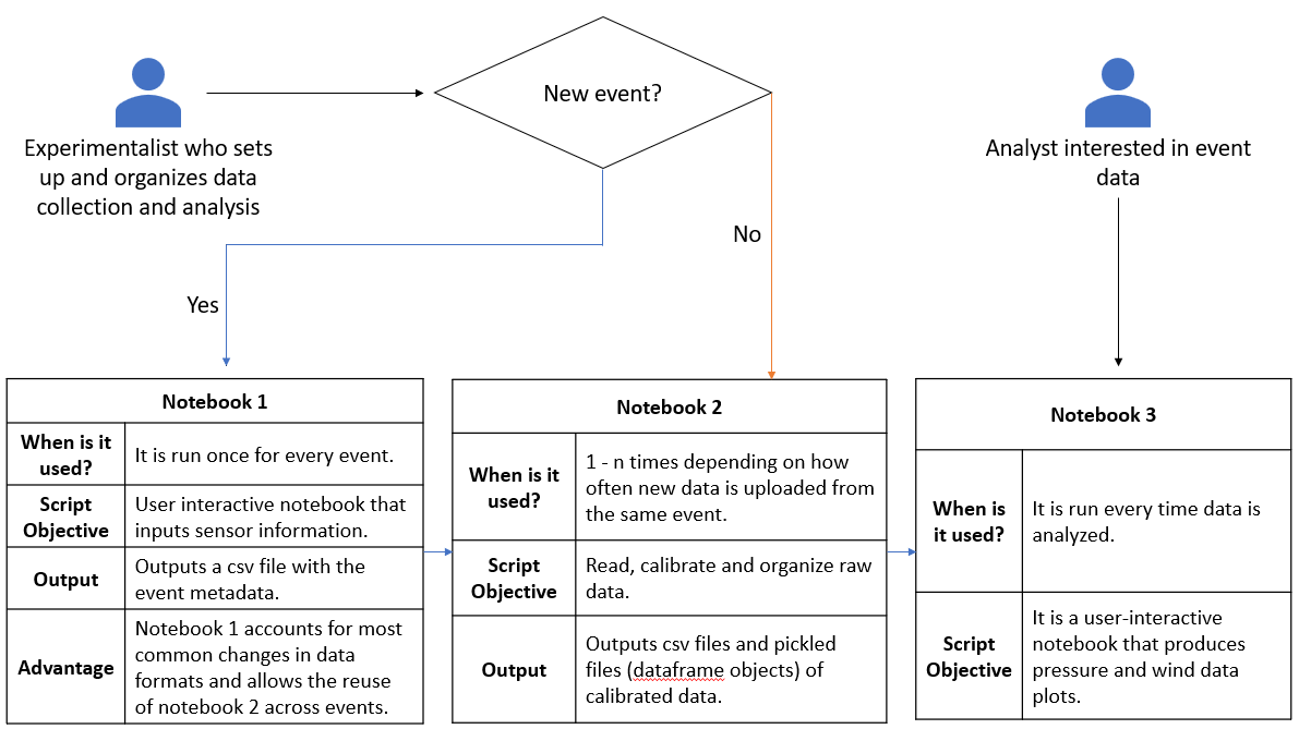
Figure 3. Sequence of analysis
Adaptation to Different Datasets
The first notebook is a user interactive guide to input important raw data information. This notebook saves time as the user does not have to read, understand and edit the code to change information regarding sensors, columns and data formats. For example, WSNS deployment during the tropical storm Isaias (8/2/2020) used an old and a new WSNS system. The first notebook documented the significant differences in data storage between the two systems. This accelerates data processing as there is no change required in code and the file generated by the notebook acts as a metadata for the second notebook responsible for data processing. Figure 4 below shows snapshots of the output file created by the first notebook describing raw data information from two different systems.
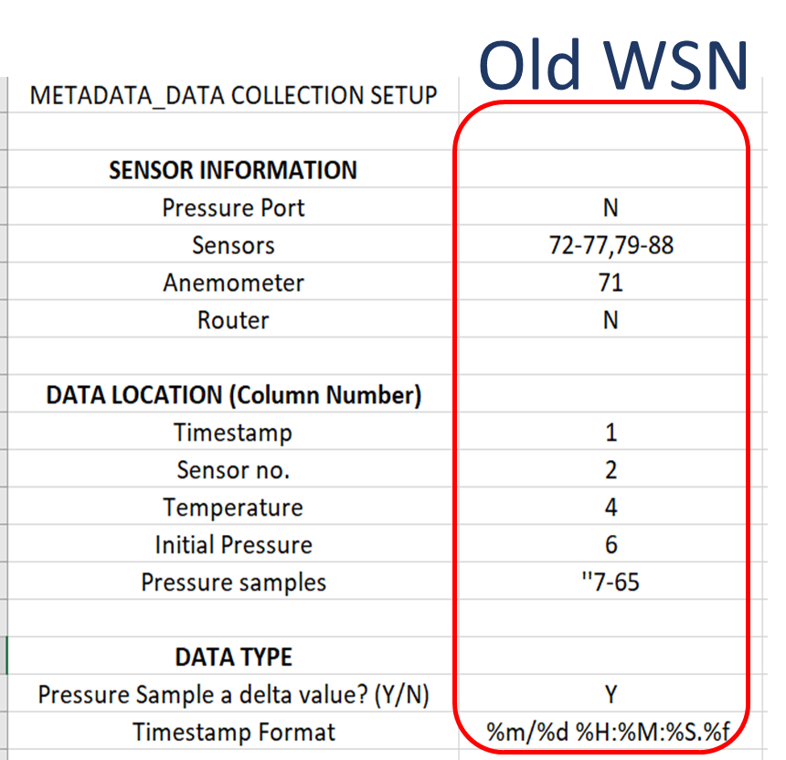
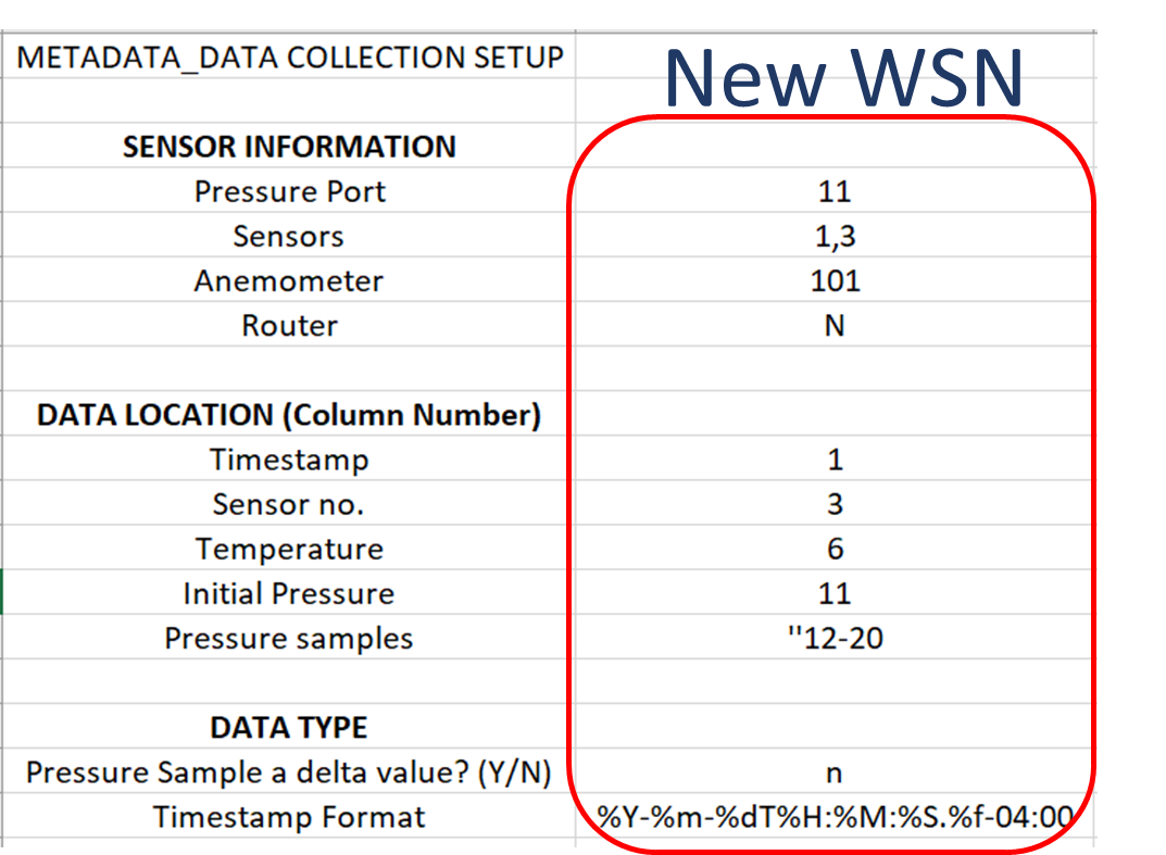
Figure 4. Snapshots of output files
Jupyter Notebooks for WOW Sliding Platio Door
Analyses Notebooks and Examples
The project goal is to measure pressure variation on non-structural components during either strong wind events or full-scale testing in the WoW, using the network of wireless sensors. The analysis notebooks on DesignSafe are user interactive with markdowns describing the test. They also provide the users with several options to visualize the data. For example, figure 5a shows the analysis notebook for Isaias (tropical storm on August 1-3, 2020) while Figure 5b shows the analysis notebook for WoW test. The markdowns have important information and pictures from the deployment, and instructions for the user to easily access data.
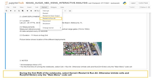
Figure 5a. Analysis notebook for Isaias (field deployment)
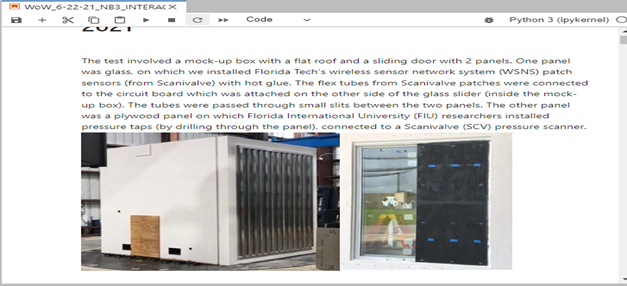
Figure 5b. Analysis notebook for WoW test (wind tunnel deployment)
Figure 6 shows the menu that allows users to select from options and look at specific time windows or test conditions.
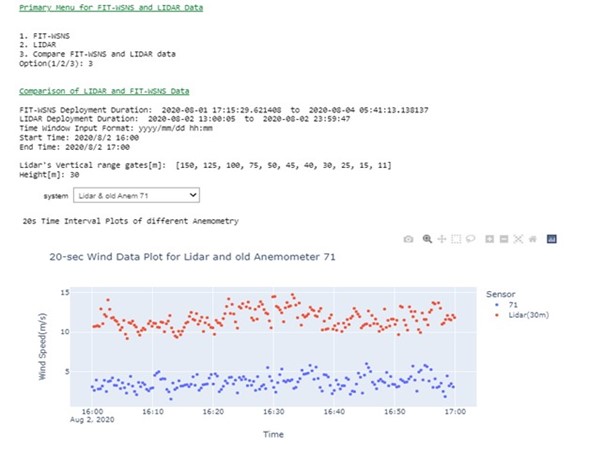
Figure 6. Menu options in Analysis Notebook
Using Plotly for Data Driven Animation Frames
The project objective is to study high impact wind events on non-structural components of residential houses. After the deployment or the test, Jupyter notebooks process and visualize important data for different purposes, including among others: comparisons to ASCE 7 standard; and assessment of sensor performance with respect to wind conditions. Plotly can create animation frames to look at a snapshot of data from all sensors in different test conditions or even at different timestamps. A single line of code enabled with the right data frame can quickly reveal trends in the data and facilitate troubleshooting of any system errors. Figure 7 below shows an application of plotly for one of the Wall of Wind tests for glass sliding doors. The test model was a mock-up box with flat roof, and full-scale glass sliding doors, which were tested at 105 mph for different wind directions. At uniform velocity, data for each wind direction was collected for 3 minutes and the program computed pressure coefficient Cp values averaged over that time window. A 2D scanner plot was created with x and z dimensions with each point representing a sensor whose colour corresponded to a Cp value on the colour scale. A single line of code enables the animation frame, which reveals important information:
px.scatter(dataframe, x=x column, y=y column, color=scatter point values, text=text to be displayed for each point, range_color=color scale range, animation_frame=variable for each animation frame, title = plot title)Including dimensions and trace lines to the plots can add more clarity.
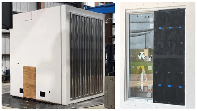
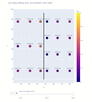
Figure 7. Application of Plotly for one of the Wall of Wind tests for glass sliding doors
Plotly features example
The exercise below is an illustration of these plotly features:
Requirements:
Access Jupyter Notebook on DesignSafe. Once you have your notebook open and you don’t have plotly dash installed, go ahead and use: !pip install dash==1.14.0 --user
Building the Dataframe: Building the Dataframe: Consider a box of spheres that change their numbers ranging from 1 to 10 every hour. You want to look at how the number changes for 12 hours.
Code
#import Libraries
import random
import pandas as pd
# Define necessary columns
spheres = [1, 2, 3, 4, 5]
x = [6, 14, 10, 6, 14]
y = [6, 6, 10, 14, 14]
rad = []
# Generating 5 random numbers ranging from 1 to 10 for the first hour
for i in range(0, 5):
    n = random.randint(1, 10)
    rad.append(n)
hour = 1
Label = ['1', '2', '3', '4', '5']
# DataFrame for the first hour
df = pd.DataFrame(spheres, columns=['Sphere'])
df['x'] = x
df['y'] = y
df['number'] = rad
df['hour'] = hour
df['label'] = Label
# Loop for the next 11 hours
for i in range(0, 11):
    hour = hour+1
    temp = pd.DataFrame(spheres, columns=['Sphere'])
    temp['x'] = x
    temp['y'] = y
    rad = []
    for i in range(0, 5):
        n = random.randint(1, 10)
        rad.append(n)
    temp['number'] = rad
    temp['hour'] = hour
    temp['label'] = Label
    df = df.append(temp, ignore_index=True)
print(df)
Matching the right columns to suit the syntax will result in an animation frame and a slider!
import plotly.express as px
import plotly.graph_objects as go
from IPython.display import display, HTML
fig = px.scatter(df, x='x',y='y', color='number',text="label",
 animation_frame='hour',title='Magic Box') #animation frame
fig.update_traces(textposition='top center',mode='markers', marker_line_width=2, marker_size=40)
trace1 = go.Scatter(x=[2, 2], y=[2, 18],line=dict(color='black', width=4),showlegend=False) #Tracelines to create the box
trace2 = go.Scatter(x=[2, 18], y=[18, 18],line=dict(color='black', width=4),showlegend=False)
trace3 = go.Scatter(x=[18, 18], y=[18, 2],line=dict(color='black', width=4),showlegend=False)
trace4 = go.Scatter(x=[18, 2], y=[2, 2],line=dict(color='black', width=4),showlegend=False)
fig.add_trace(trace1)
fig.add_trace(trace2)
fig.add_trace(trace3)
fig.add_trace(trace4)
fig.update_layout(autosize=False,width=500,height=500,showlegend=True)
html_file_path11 = parent_dir+'/html_images/magic_box.html'
fig.write_html(html_file_path11, include_plotlyjs='cdn')
display(HTML(filename=html_file_path11))display(HTML(filename=html_file_path11))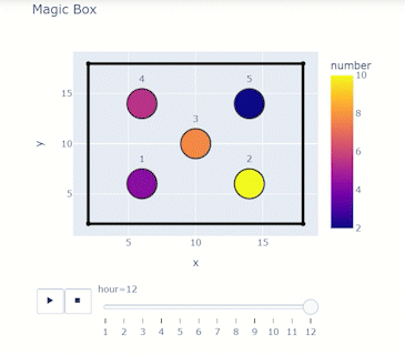
Hurricane Data Integration & Visualization
Geospatial Hurricane Disaster Reconnaissance Data Integration and Visualization Using KeplerGl
Pinelli, J.-P. – Florida Tech
Sziklay, E. – Florida Tech
Ajaz, M.A. – Florida Tech
Key Words: Hurricane, Disaster Reconnaissance, StEER Network, NSI Database, wind field, JupyterLab, API, JSON, KeplerGI
Resources
- Jupyter notebook on DesignSafe Jupyterhub
- GitHub, https://github.com/keplergl/kepler.gl
- StEER Network, https://www.steer.network
- U.S. Geological Survey, https://stn.wim.usgs.gov/STNDataPortal/#
- NSI data base, https://www.hec.usace.army.mil/confluence/nsi
- Fulcrum, https://web.fulcrumapp.com/apps
Description
The purpose of this JupyterLab is to integrate field damage, hazard, and exposure data from past hurricane events. KeplerGl provides customizable geospatial map visualization and user-friendly analysis tools. Different kinds of data from different sources related to any hurricane event are collected. The exposure data from the National Structure Inventory (NSI) database and flood data from U.S. Geological Survey (USGS) are both collected via an application-programming interface or API. API is storage-friendly and updates automatically. In that case, the script connects to the service provider. The field damage reconnaissance data from Structural Extreme Events Reconnaissance (StEER) is available from both DesignSafe and Fulcrum without an API, whereas the wind field data from the Applied Research Associates, Inc. (ARA) wind grid is on DesignSafe.
Implementation
This use case uses Hurricane Michael as an example to illustrate the data collection, integration, and visualization on the map. This software can be extended to other hazards like tornadoes and earthquakes. Figure 1 shows the main components of the data integration for Hurricane Michael. All the components are georeferenced. They are displayed in different layers in KeplerGl.
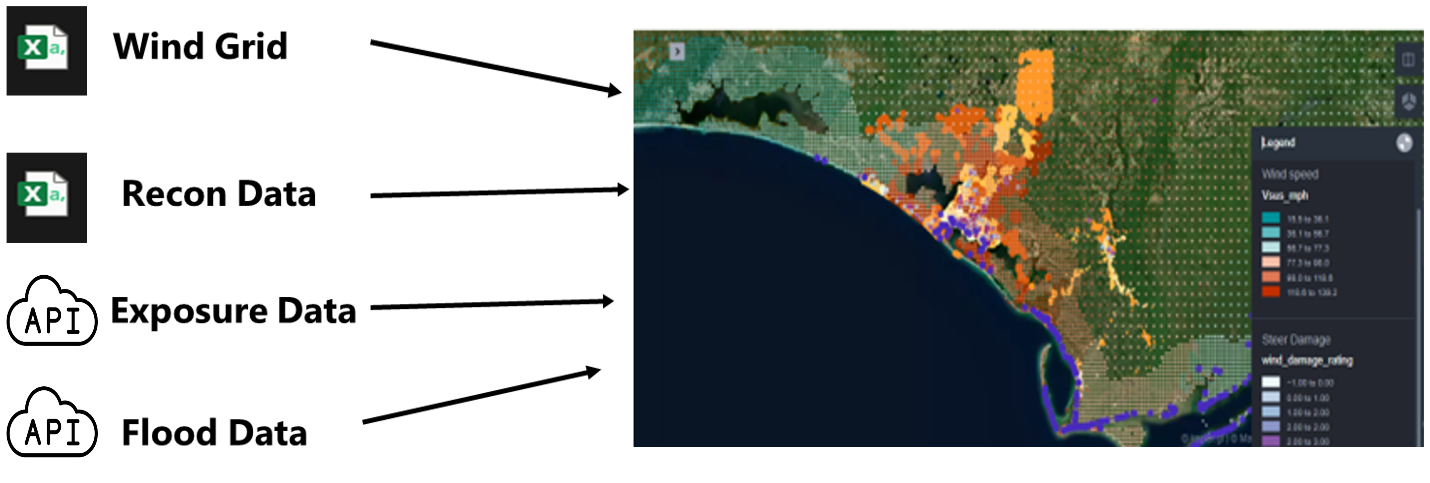
Figure 1. Integration of Hazard, Reconnaissance and Exposure Data
Instructions
Using JupyterHub on DesignSafe
Accessing JupyterHub
Navigate to the JupyterHub: Use this link to go directly to the JupyterHub portal on DesignSafe. Sign In: You must have a TACC (Texas Advanced Computing Center) account to access the resources. If you do not have an account, you can register here. Access the Notebook: Once signed in, you can access and interact with the Jupyter notebooks available on your account. To run this Notebook, FirstMap.ipynb you must copy it to your MyData directory to make it write-able as it is read only in NHERI- published directory. Use your favorite way to lunch a Jupyter Notebook and then open the FirstMap.ipynb file.
-
Run the following command cell to copy the project to your MyData or change path to wherever you want to copy it to: after opening this Notebook in MyData you don't have to run the below cell again !umask 0022; cp -r /home/jupyter/NHERI-Published/PRJ-3903v3/home/jupyter/MyData/PRJ-3903; chmod -R u+rw /home/jupyter/MyData/PRJ-3903
-
Navigate to your 'MyData' directory. For illustrative purposes, input files have been created and shared in this project. These files have been pre-processed and conveniently organized used to illustrate the data collection, integration, and visualization on the map. The outcomes as follows:
- 2018-Michael_windgrid_ver36.csv
- hex_config.py
- Steer_deamage.csv
- FirstMap.ipynb Results:
- first_map.html
- first_map_read_only.html
Jupyter Notebooks
Installing and importing the required packages
When using the JupyterLab for the first time, some packages need to be installed. Start a new console by clicking File > New Console for Notebook and copy and paste the following code:
jupyter lab clean --all && pip install --no-cache-dir --upgrade keplergl && \ jupyter labextension install @jupyter-widgets/jupyterlab-manager keplergl-jupyter
The code above installs KeplerGl, as well as the required dependencies.
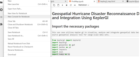
Figure 2. Open a New Console.
There is no need to install geopandas, pandas and json. These are built in modules in Python. As for the installation of the remaining two packages, use the following commands in the same console:
pip install requests
pip install numpy
Get the exposure data from the NSI database
Exposure or building data is one of the main components of the integrated model. The NSI provides access to building data from diverse sources across 50 states in the US and it is updated on a yearly basis. For each building, public and private fields are provided. This JupyterLab accesses the publicly available fields only. It is possible to get access to the private fields through a Data Use Agreement with Homeland Infrastructure Foundation-Level Data (HIFLD). The public fields include valuable building attributes such as occupation type (occtype), building type (bldgtype), square footage of the structure (sqft), foundation type (found type), foundation height (found_ht), number of stories (num_story), median year built (med_yr_blt) and ground elevation at the structure (ground_elv). Building data can be accessed from NSI in two ways, one by direct download in json format or via the API service. This JupyterLab provides data access via API. Figure 3 shows how the script establishes two API connections and sends requests.
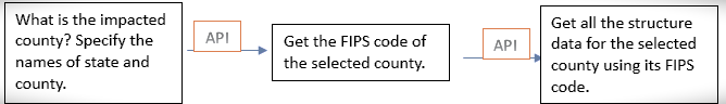
Figure 3. Process of Exposure Data Access via APIs.
Each state and county in the United Sates have a unique FIPS code. Building data from the NSI database can be accessed for each county using its proper FIPS code. The following code gets the FIPS code of the county of interest.
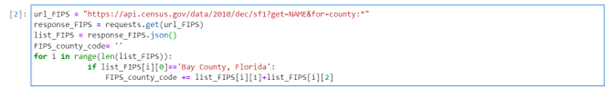
In this example we get building data in Bay County, Florida. For any other county, replace 'Bay County, Florida' with the desired county and state. Keep this format exactly as it is. Capitalize the first letters and write a comma after County.
Download ARA Wind and Building Damage Data
ARA wind grid data for hurricane events is available on DesignSafe for each event. The grid wind data includes two fields: The 1-minute sustained maximum wind speed (mph) and the 3-second maximum wind gust (mph), both at 10-meters for open terrain. Both can be displayed as separate layers on the map.
StEER reconnaissance data can be accessed and downloaded from https://web.fulcrumapp.com/apps or from DesignSafe (Roueche at al.2020).
In this script we access the data from Fulcrum. Both ARA wind and the StEER damage reconnaissance data must be in CSV format and in UTF-8 Unicode.
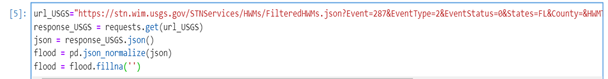
Getting flood data from USGS via JSON REST Service
REST is a common API that that uses HTTP requests to access and use data. To get the REST URLs for a hazard event where flood was present, visit https://stn.wim.usgs.gov/STNDataPortal/#, browse the flood event (in this use case it is 2018 Michael) and hit the 'Get REST URL' button at the bottom of the page (see figure 4).
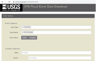
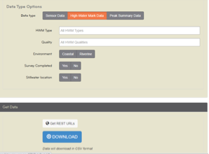
Figure 4. Accessing JSON REST on USGS
The desired URL pops up in a new window. Copy and replace the JSON REST Service URL in the first line of the code below.
Adding previously collected data and displaying them on the map
As the Python script adds data to the map, the user still must set it up to display using the panel on the left. In fact, a new layer needs to be added and configured for each data source. The left panel is activated and deactivated by clicking on the small arrow, circled in red on Figure 5.
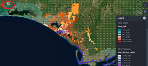
Figure 5. Every data is added as a new layer on the map.
For each new layer, the user specifies the basic type (point, polygon, arc, line etc.), selects the latitude and longitude fields from the data (Lat, Long) and decides on the fill color, too. The color can be based on a field value, making the map to be color-coded. In this JupyterLab, the reconnaissance damage data has been color-coded based on the wind damage rating value (0-4). The deeper purple the color, the higher the wind damage rating of the property. The layer of buildings is also color-coded based on the field median-year-built. This is an estimated value only and the map shows larger areas with the same color implying that this attribute must be treated with caution.
Finally, the maximum open terrain 1-minute sustained wind speed (mph) and 3-second wind gust (mph) at 10-meters are also color-coded.
Customizing the map further
There are several extra tools in KeplerGl that allow the user to customize the map further. The first most important capability of KeplerGl is that the map style can be changed by clicking on the Base map icon (see Figure6).
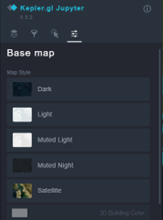
Figure 6. Changing the map style in KeplerGl
An advantage of using a map style other than Satellite is that the building footprints become visible on the map as Figure 7 shows.
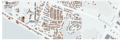
Figure 7. Microsoft Building Footprint is a built-in layer in KeplerGl
The second most important capability of KeplerGl is that the user may select the fields to be displayed when hoovering a point geometry on the map. This can be done for each layer by clicking the Interactions icon and then activating Tooltip in the panel as Figure 8 shows.
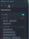
Figure 8. Selecting the most relevant fields for mouse over.
Finally, the user may draw a rectangle or polygon on the map to highlight specific areas of interest. This tool is available on the right panel by clicking the Draw on map icon.
Saving the map and exporting it as an interactive html file
After the users customized the map, if they wish to reopen it next time with the same configuration then they need to run the following code.

This code creates a configuration file in which all settings are saved. This file needs to be loaded at the beginning of the script.

The user must also click Widget > Save Notebook Widget State before shutting down the kernel to make sure it that the same map will be reloaded next time.
With the code below the most recently loaded map with all its data and configuration will be saved in the folder as an html file.

The html file generated cannot be opened directly from DesignSafe.User needs to save the html file and open locally on a browser or published on the Internet. This is an interactive html file, meaning that the user can work on the map and customize it the same way as in the JupyterLab. There is also an option to create a read-only html file by setting the read-only variable to true.
Citations and Licensing
- Please citeRathje et al. (2017)to acknowledge the use of DesignSafe resources.
- This software is distributed under the GNU General Public License.
-
Roueche, D., T. Kijewski-Correa, J. Cleary, K. Gurley, J. Marshall, J. Pinelli, D. Prevatt, D. Smith, K. Ambrose, C. Brown, M. Moravej, J. Palmer, H. Rawajfih, M. Rihner, (2020) "StEER Field Assessment Structural Team (FAST)", in StEER - Hurricane Michael. DesignSafe-CI. https://doi.org/10.17603/ds2-5aej-e227.
-
This use-case page was last updated on 5/1/2024
ADCIRC Datasets
ADCIRC Use Case - Creating an ADCIRC DataSet on DesignSafe
Clint Dawson, University of Texas at Austin
Carlos del-Castillo-Negrete, University of Texas at Austin
Benjamin Pachev, University of Texas at Austin
Overview
The following use case demonstrates how to compile an ADCIRC data-set of hind-casts on DesignSafe. This workflow involves the following steps:
- Finding storm-surge events.
- Compiling meteorological forcing for storm surge events.
- Running ADCIRC hind-casts using meteorological forcing.
- Organize and publish data on DesignSafe, obtaining a DOI for your research and for others to cite your data when re-used.
The workflow presented here is a common one performed for compiling ADCIRC data-sets for a variety of purposes, from Uncertainty Quantification to training Surrogate Models. Whatever your application is of ADCIRC data, publishing your dataset on DesignSafe allows you to re-use your own data, and for others to use and cite your data as well.
To see a couple of Example data-sets, and associated published research using the datasets, see the following examples:
- Texas FEMA Storms - Synthetic storms for assessing storm surge risk. Used recently in Pachev et. al 2023 to train a surrogate model for ADCIRC for the coast of Texas.
- Alaska Storm Surge Events - Major storm surge events for the coast of Alaska. Also used in Pachev et. al 2023 for creating a surrogate model for the coast of Alaska.
An accompanying jupyter notebook for this use case can be found in the ADCIRC folder in Community Data under the name Creating an ADCIRC DataSet.ipynb.
Resources
Jupyter Notebooks
The following Jupyter notebooks are available to facilitate the analysis of each case. They are described in details in this section. You can access and run them directly on DesignSafe by clicking on the "Open in DesignSafe" button.
| Scope | Notebook |
|---|---|
| Create an ADCIRC DataSet | Creating an ADCIRC DataSet.ipynb |
DesignSafe Resources
The following DesignSafe resources were leveraged in developing this use case.
Background
Citation and Licensing
- Please cite Rathje et al. (2017) to acknowledge the use of DesignSafe resources.
- This software is distributed under the GNU General Public License.
ADCIRC Overview
For more information on running ADCIRC and documentation, see the following links:
ADCIRC is available as a standalone app accessible via the DesignSafe front-end.
ADCIRC Inputs
An ADCIRC run is controlled by a variety of input files that can vary depending on the type of simulation being run. They all follow the naming convention fort.# where the # determines the type of input/output file. For a full list of input files for ADCIRC see the ADCIRC documentation. At a high level the inputs compose of the following:
- Base Mesh input files - Always present for a run. It will be assumed for the purpose of this UseCase that the user starts from a set of mesh input files.
- fort.14 - ADCIRC mesh file, defining the domain and bathymetry.
- fort.15 - ADCIRC control file, containing (most) control parameters for the run. This includes:
- Solver configurations such as time-step, and duration of simulation.
- Output configurations, including frequency of output, and nodal locations of output.
- Tidal forcing - At a minimum, ADCIRC is forced using tidal constituents.
- Additional control files (there are a lot more, just listing the most common here):
- fort.13 - Nodal attribute file
- fort.19, 20 - Additional boundary condition files.
- Meteorological forcing files - Wind, pressure, ice coverage, and other forcing data for ADCIRC that define a particular storm surge event.
- fort.22 - Met. forcing control file.
- fort.221, fort.222, fort.225, fort.22* - Wind, pressure, ice coverage (respective), and other forcing files.
The focus of this use case is to compile sets of storm surge events, each comprising different sets of forcing files, for a region of interest defined by a set of mesh control files.
PyADCIRC
The following use case uses the pyADCIRC python library to manage ADCIRC input files and get data from the data sources mentioned above. The library can be installed using pip:
$ pip install pyadcircThe pyadcirc.data contains functions to access two data sources in particular. First is NOAAs tidal gauge data for identifying storm surge. They provide a public API for accessing their data, for which pyADCIRC provides a python function and CLI (command line interface) wrapper around. The tidal signal at areas of interest over our domain will allow us to both identify potential storm surge events, and verify ADCIRC hind-casts with the real observations.
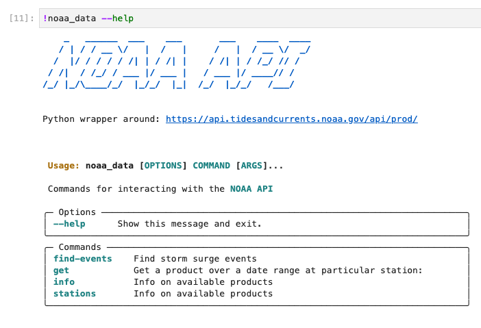
NOAA API CLI provided by the pyadcirc library. The noaa_data executable end point is created whenever pyadcirc is installed as library in an environment, providing a convenient CLI for interacting with the NOAA API that is well documented.
The second data source is NCAR’s CFSv1/v2 data sets for retrieving meteorological forcing files for identify storm surge events. An NCAR account is required for accessing this dataset. Make sure to go to NCAR's website to request an account for their data. You'll need your login information for pulling data from their repositories. Once your account is set-up, you'll want to store your credentials in a json file in the same directory as this notebook, with the name .ncar.json.
For example the file may look like:
{"email": "user@gmail.com", "pw": "pass12345"}Example Notebook: Creating ADCIRC DataSet
The example within this use case comprises of 4 main steps to create a data-set starting from a set of ADCIRC control input files. The notebook can be found at in the ADCIRC Use Case’s folder with the name Creating an ADCIRC DataSet.ipynb . Note that the notebook should be copied to the users ~/MyData directory before being able to use it (these steps are covered in the notebook). ![]()
The notebook covers the first two steps of this use case, namely identifying storm surge events and creating base input data sets to run using ADCIRC. We briefly overview the notebook’s results below.
Identifying storm surge events
The first stage of the notebook involves using the NOAA API wrapper provided by pyADCIRC to find storm surge events by looking at tidal gauge data in a region of interest. An example of an identified storm surge event, corresponding to Typhoon Merbok that hit the coast of Alaska in September 2022, is shown below.
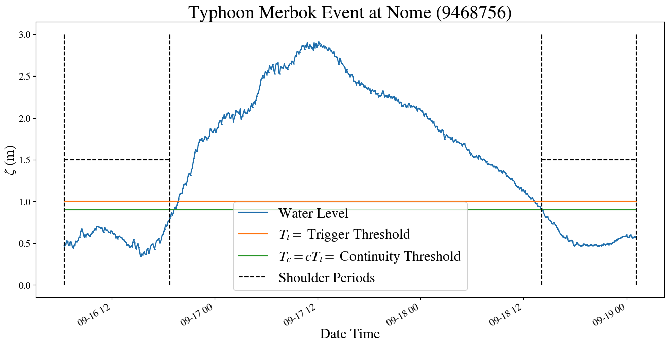
Result of identification algorithm for the range of dates containing Typhoon Merbok. The algorithm operates by defining a trigger threshold, along with other heuristics, by which to group distinct groups of storm surge events.
The algorithm presented is run on the storms that see the most frequent storm-surge activity over the coast of Alaska, Nome, Red Dog Dock, and Unalakleet. All events are compiled to give date ranges of storm surge events to produce ADCIRC hind-casts for.
Getting data forcing data
Having identified dates of interest, the notebook then uses the ncar library endpoint to pull meteorological forcing for the identified potential storm surge events. These are then merged with ADCIRC base input files (available at the published data set), to create input runs for an ensemble of ADCIRC simulations, as covered in the use case documentation on running ADCIRC ensembles in DesignSafe.
Organizing Data for publishing
Having a set of simulated ADCIRC hind-casts for one or more events, along with any additional analysis performed on the hind-cast data, the true power of DesignSafe as a platform can be realized by publishing your data. Publishing your data allows you and other researchers to reference its usage with a DOI. For ADCIRC, this is increasingly useful as more Machine Learning models are being built using ADCIRC simulation data.
This section will cover how to organize and publish an ADCIRC hind-cast dataset as created above. Note this dataset presented in this use case is a subset of the Alaska Storm Surge Data set that has been published, so please refrain from re-publishing data.
The steps for publishing ADCIRC data will be as follows
- Create a project directory in the DesignSafe data repository.
- Organize ADCIRC data and copy to project directory.
- Curate data by labeling and associating data appropriately.
While DesignSafe has a whole guide on how to curate and publish data, we note that the brief documentation below gives guidance on how to apply these curation guidelines to the particular case of ADCIRC simulation data.
Setting up Project Directory
First you’ll want to create a new project directory in the DesignSafe data repository.
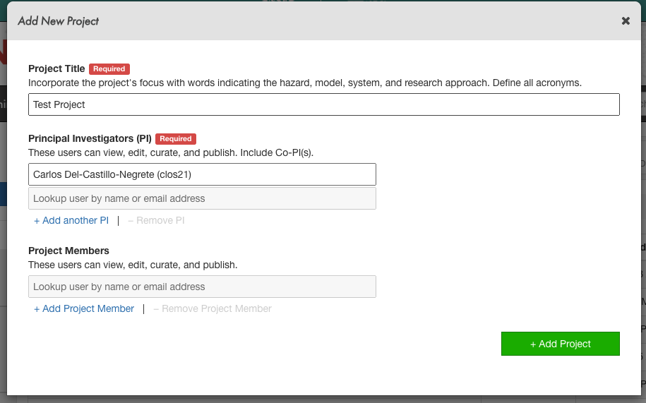
Creating a new project in DesignSafe’s Data Depot.
Next we want to move ADCIRC inputs/outputs from your Jupyter instance where they were created into this project directory. We note that you must first restart your server if your moving data to a project directory that didn’t exist at the time from your server started, as that project directory won’t be in your ~/projects directory. Furthermore you’ll want to organize your folder structure in the command line before moving it to the project directory. See below for the recommended folder structure and associated data curation labels for publishing ADCIRC datasets.
.
├── Report.pdf -> Label as Report - PDF summarizing DataSet
├── mesh -> Label as Simulation Input (ADCIRC Mesh Type)
│   ├── fort.13
│   ├── fort.14
│   ├── fort.15
│   ├── fort.22
│   ├── fort.24
│   └── fort.25
├── inputs -> Label as Simulation Input (ADCIRC Meteorological Type)
│   ├── event000
│   │   ├── fort.15
│   │   ├── fort.221
│   │   ├── fort.222
│   │   └── fort.225
│   └── event001
│       ├── fort.15
│       ├── fort.221
│       ├── fort.222
│       └── fort.225
└── outputs -> Label as Simulation Output (ADCIRC Output)
    ├── event000
    │   ├── fort.61.nc
    │   ├── ...
    │   ├── maxele.63.nc
    │   ├── maxrs.63.nc
    │   ├── maxvel.63.nc
    │   ├── maxwvel.63.nc
    │   └── minpr.63.nc
    └── event001
        ├── fort.61.nc
        ├── ...
        ├── maxele.63.nc
        ├── maxrs.63.nc
        ├── maxvel.63.nc
        ├── maxwvel.63.nc
        └── minpr.63.nc
└── Analysis ->  Label as Analysis  any notebooks/code/images.
    ├── OverviewNotebook.ipynb - Analysis over all events.
    ├── event000
    │   ├── ExampleNotebook.ipynb - Event specific analysis.
    │   ├── ...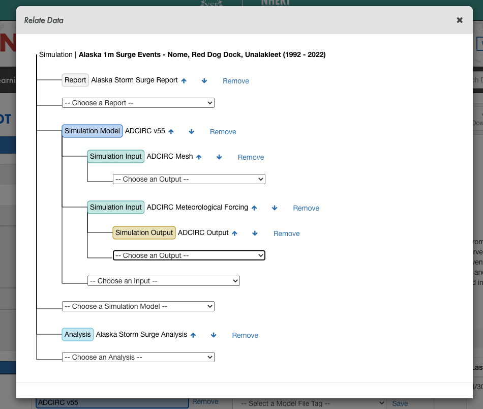
Example data relation diagram for an ADCIRC Simulation DataSet
Large-Scale Storm Surge
ADCIRC Use Case - Using Tapis and Pylauncher for Ensemble Modeling in DesignSafe
Clint Dawson, University of Texas at Austin
Carlos del-Castillo-Negrete, University of Texas at Austin
Benjamin Pachev, University of Texas at Austin
The following use case presents an example of how to leverage the Tapis API to run an ensemble of HPC simulations. The specific workflow to be presented consists of running ADCIRC, a storm-surge modeling application available on DesignSafe, using the parametric job launcher pylauncher. All code and examples presented are meant to be be executed from a Jupyter Notebook on the DesignSafe platform and using a DesignSafe account to make Tapis API calls.
Resources
Jupyter Notebooks
Accompanying jupyter notebooks for this use case can be found in the ADCIRC folder in Community Data. You may access these notebooksdirectly:
| Scope | Notebook |
|---|---|
| Create an ADCIRC DataSet | Creating an ADCIRC DataSet.ipynb |
| Create an Ensemble Simulations | ADCIRC Ensemble Simulations.ipynb |
DesignSafe Resources
The following DesignSafe resources were used in developing this use case.
Background
Citation and Licensing
-
Please cite Rathje et al. (2017) to acknowledge the use of DesignSafe resources.
-
This software is distributed under the GNU General Public License.
ADCIRC
For more information on running ADCIRC and documentation, see the following links:
ADCIRC is available as a standalone app accesible via the DesignSafe front-end.
Tapis
Tapis is the main API to control and access HPC resources with. For more resources and tutorials on how to use Tapis, see the following:
To initialize tapis in our jupyter notebook we use AgavePy. Relies on tapis auth init --interactive being run from a terminal first upon initializing your Jupyter server.
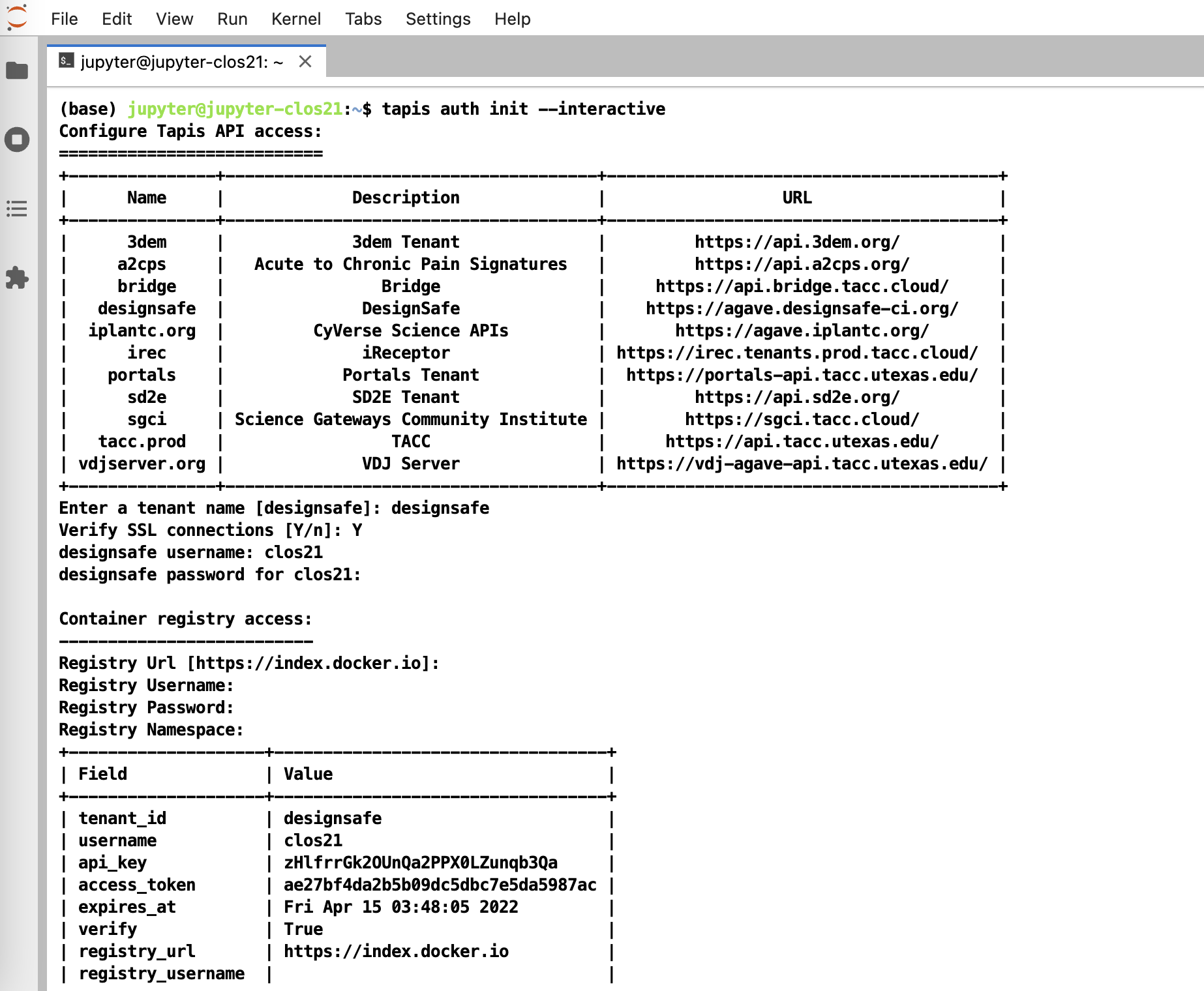
Initialize Tapis from within a shell in a jupyter session. A shell can be launched by going to File -> New -> Terminal.
Once this is complete, you can now run from a code cell in your jupyter session the following to load your AgavePy credentials:
from agavepy.agave import Agave

ag = Agave.restore()
Pylauncher
Pylauncher is a parametric job launcher used for launching a collection of HPC jobs within one HPC job. By specifying a list of jobs to execute in either a CSV or json file, pylauncher manages resources on a given HPC job to execute all the jobs using the given nodes. Inputs for pylauncher look something like (for csv files, per line):
num_processes,<pre process command>;<main parallel command>;<post process command>The pre-process and post-process commands are executed in serial, while the main command is executed in parallel using the appropriate number of processes. Note pre and post process commands should do light file management and movement and no computationally intensive tasks.
Tapis Pylauncher App
Overview of this section:
- Getting the Appication
- App Overview
- Staging Files
- Example Ensemble ADCIRC RUN
Accessing the Application
The code for the tapis application is publicly accessible at https://github.com/UT-CHG/tapis-pylauncher. A public Tapis application exists using version 0.0.0 of the application deployed under the ID pylauncher-0.0.0u1.
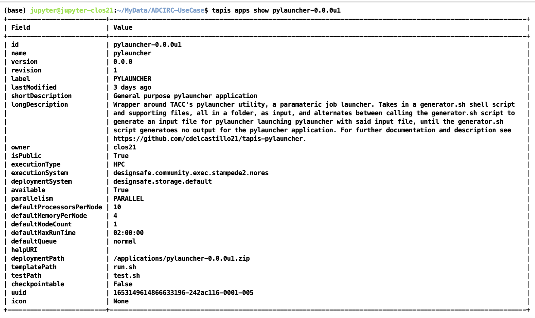
The publicly available pylauncher application should be available to all users via the CLI/API, but will not be visible via DesignSafe's workspaces front-end.
Basic Application Overview
The tapis-pylauncher application loops through iterations of calling pylauncher utility, using as input a file generated by a user defined generator shell script generator.sh. A simplified excerpt of this main execution loop is as follows:
### Main Execution Loop:
###   - Call generator script.
###   - Calls pylauncher on generated input file. Expected name = jobs_list.csv
###   - Repeats until generator script returns no input file for pylauncher.
ITER=1
while :
do
  # Call generator if it exists script
  if [ -e generator.sh ]
  then

    ./generator.sh ${ITER} $SLURM_NPROCS $generator_args
  fi

  # If input file for pylauncher has been generated, then start pylauncher
  if [ -e ${pylauncher_input} ]
  then
    python3 launch.py ${pylauncher_input} >> pylauncher.log
  fi

  ITER=$(( $ITER + 1 ))
done
Note how a generator script is not required, with a static pylauncher file, of input name determined as a job parameter pylauncher_input, being sufficient to run a single batch of jobs.
All input scripts and files for each parametric job should be zipped into a file and passed as an input to the pylauncher application. Note that these files shouldn't be too large and shouldn't contain data as tapis will be copying them around to stage and archive jobs. Data should ideally be pre-staged and not part of the zipped job inputs.
Staging Files
For large scale ensemble simulations, it is best to stage individual ADCIRC run files in a project directory that execution systems can access before-hand so that Tapis itself isn't doing the moving and staging of data.
The corresponding TACC base path to your project with a particular id can be found at /corral-repl/projects/NHERI/projects/[id]/. To find the ID for your project, you can just look at the URL of your project directory in designsafe:
TX FEMA storms project directory. Note how the URL on top contains the Project ID corresponding to the path on corral that login nodes on TACC systems should have access to.
From a login node then (assuming this is done on stampede2), the data can be staged onto a public directory on /work as follows. First we create a public directory in our workspace where the data will be staged:
(base) login2.stampede2(1020)$ cd $WORK
(base) login2.stampede2(1022)$ cd ..
(base) login2.stampede2(1023)$ ls
frontera lonestar longhorn ls6 maverick2 pub singularity_cache stampede2
(base) login2.stampede2(1024)$ pwd
/work2/06307/clos21
(base) login2.stampede2(1026)$ chmod o+x
(base) login2.stampede2(1027)$ mkdir -p pub
(base) login2.stampede2(1028)$ chmod o+x pub
(base) login2.stampede2(1029)$ cd pub
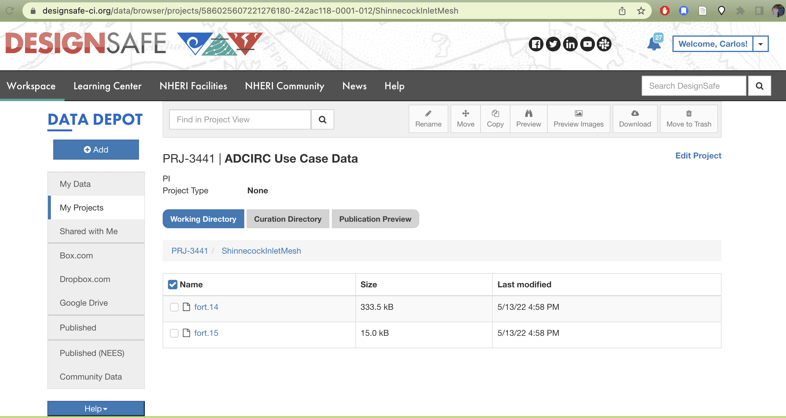
(base) login2.stampede2(1030)$ mkdir -p adcirc/inputs/ShinnecockInlet/mesh/testNext we copy the data from our project directory to the public work directory
(base) login2.stampede2(1039)$ cp /corral-repl/projects/NHERI/projects/586025607221276180-242ac118-0001-012/ShinnecockInletMesh/* adcirc/inputs/ShinnecockInlet/mesh/test/Finally we change the ownership of the files and all sub-directories where the data is staged to be publicly accessible by the TACC execution systems. Which we can check via the file permissions of the final directory we created with the staged data:
(base) login2.stampede2(1040)$ chmod -R a-x+rX adcirc
(base) login2.stampede2(1042)$ cd adcirc/inputs/ShinnecockInlet/mesh/test
(base) login2.stampede2(1043)$ pwd
/work2/06307/clos21/pub/adcirc/inputs/ShinnecockInlet/mesh/test
(base) login2.stampede2(1045)$ ls -lat
total 360
-rw-r--r-- 1 clos21 G-800588 341496 May 13 17:27 fort.14
-rw-r--r-- 1 clos21 G-800588  15338 May 13 17:27 fort.15
drwxr-xr-x 2 clos21 G-800588   4096 May 13 17:26 .
drwxr-xr-x 4 clos21 G-800588   4096 May 13 17:24 ..
The directory /work2/06307/clos21/pub/adcirc/inputs/ShinnecockInlet/mesh/test now becomes the directory we can use in our pylauncher configurations and scripts to access the data to be used for the ensemble simulations.
Example Ensemble Run: Shinnecock Inlet Test Grid Performance
For an example of how to use the tapis-pylauncher application, we refer to the accompanying notebook in the ADCIRC Use Case folder in the Community Data directory.
The notebook goes over how to run ADCIRC on the Shinnecock Inlet Test Grid.
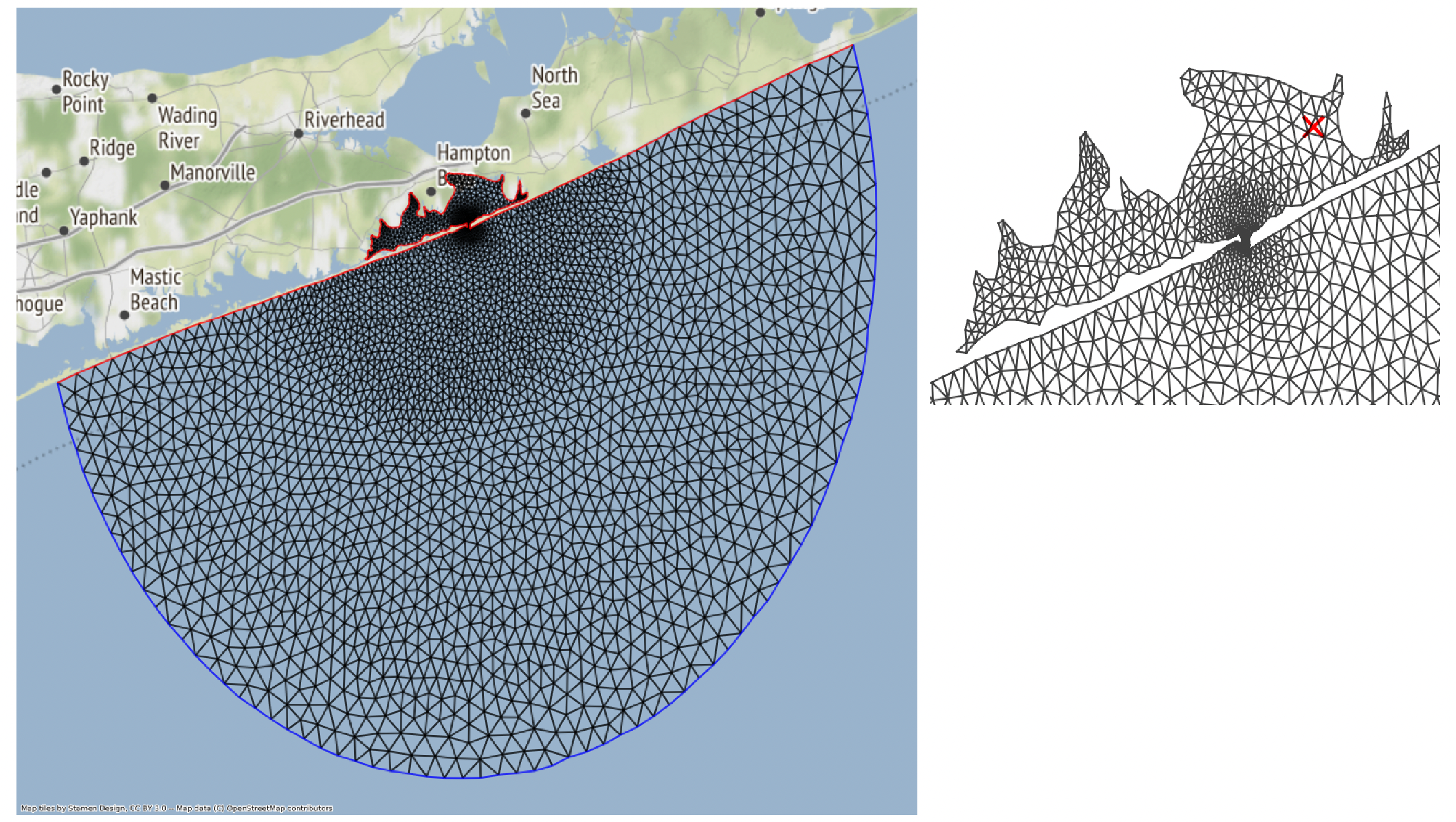
Shinnecock Inlet Test Grid. ADCIRC solves the Shallow Water Equations over a Triangular Mesh, depicted above.
An ensemble of adcirc simulations using different amounts of parallel processes on the same grid is configured, and output from active and archived job runs is analyzed to produced bar plots of run-time versus number of processors used for the Shinneocock Inlet Grid.
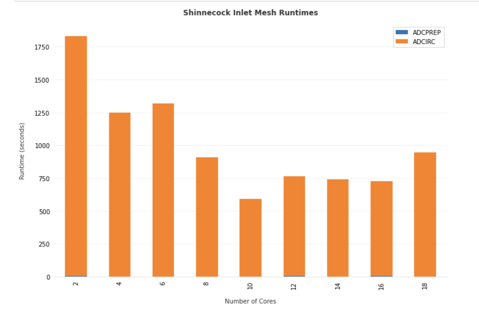
Total Runtime for ADCIRC on the Shinnecock Inlet grid pictured above using different number of processors on stampede2.
CFD Analysis of Winds on Structures
CFD Simulations using the Jupyter Notebooks
Fei Ding - NatHaz Modeling Laboratory, University of Notre Dame
Ahsan Kareem - NatHaz Modeling Laboratory, University of Notre Dame
Dae Kun Kwon - NatHaz Modeling Laboratory, University of Notre Dame
OpenFOAM is the free, open source CFD software and is popularly used for computationally establishing wind effects on structures. To help beginners overcome the challenges of the steep learning curve posed by OpenFOAM and provide users with the capabilities of generating repetitive jobs and advanced functions, this use case example presents the work to script the workflow for CFD simulations using OpenFOAM in the Jupyter Notebooks. The developed two Jupyter Notebooks can aid in determining inflow conditions, creating mesh files for parameterized building geometries, and running the selected solvers. They can also contribute to the education for CFD learning as online resources, which will be implemented in the DesignSafe.
All files discussed in this use case are shared at Data Depot > Community Data. It is recommended that users make a copy of the contents to their directory (My Data) for tests and simulations.
Resources
Jupyter Notebooks
The following Jupyter notebooks are available to facilitate the analysis of each case. They are described in details in this section. You can access and run them directly on DesignSafe by clicking on the "Open in DesignSafe" button.
| Scope | Notebook |
|---|---|
| Jupyter PyFoam Example | Jupyter_PyFoam.ipynb |
| Use case Example | OpenFOAM_Run_example.ipynb |
DesignSafe Resources
The following DesignSafe resources were leveraged in developing this use case.
OpenFoam
ParaView
Jupyter notebooks on DS Juypterhub
Background
Citation and Licensing
- Please cite Ding and Kareem (2021) to acknowledge the use of any resources from this use case.
- Please cite Rathje et al. (2017) to acknowledge the use of DesignSafe resources.
- This software is distributed under the GNU General Public License.
OpenFOAM with the Jupyter Notebook for creating input environments
The overall concept of the OpenFOAM workflow may be expressed as physical modeling-discretisation-numerics-solution-visualization as shown in Fig. 1.
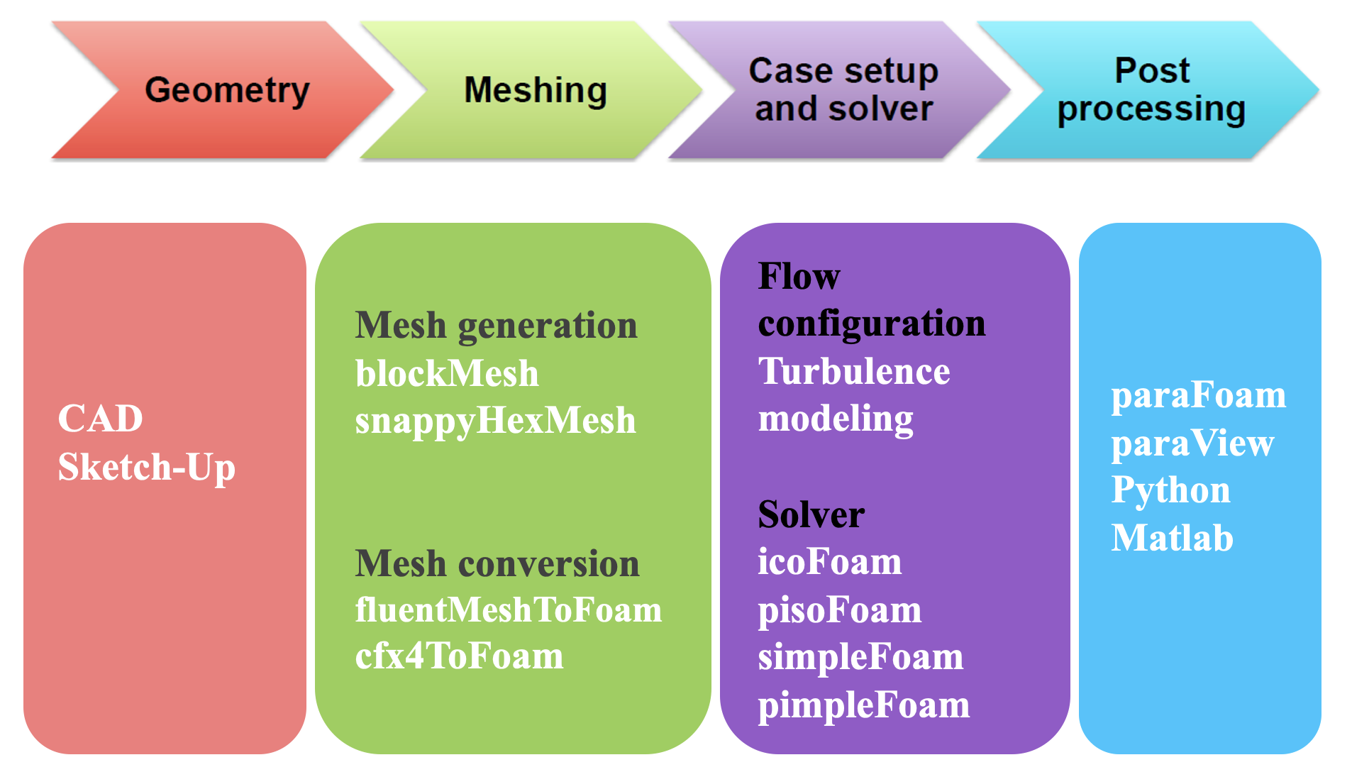
Fig. 1 OpenFOAM workflow for CFD modeling
Prerequisite to run OpenFOAM simulation
To run a CFD simulation using OpenFOAM, three directories (and associated input files) named 0, constant and system should be predefined by users. If the root directory of the directories is DH1_run, then it has the following directory structure [1].
DH1_run        # a root directory
  - 0          # initial and boundary conditions for CFD simulations
  - constant   # physical properties and turbulence modeling
- system # run-time control (parallel decomposition) and solverpisoFoam which is a transient solver for incompressible and turbulent flows and simpleFoam as a steady-state solver. Parallel computations in OpenFOAM allow the simulation to run in the distributed processors simultaneously.
Introducing advanced utilities to CFD modeling using PyFoam
Jupyter Notebooks can provide an interpretable and interactive computing environment to run a CFD simulation using the OpenFOAM. To introduce such flexibilities and bring maximum automation to CFD modeling using the OpenFOAM, an OpenFOAM library named PyFoam [2] can be used in the Jupyter Notebooks, which can introduce advanced tools for CFD modeling. With the aid of the PyFoam, the goal is to achieve an end-to-end simulation in which the Jupyter Notebooks can manipulate dictionaries in OpenFOAM based on the user's input as regular Python dictionaries without looking into the OpenFOAM C++ libraries (Fig. 2).
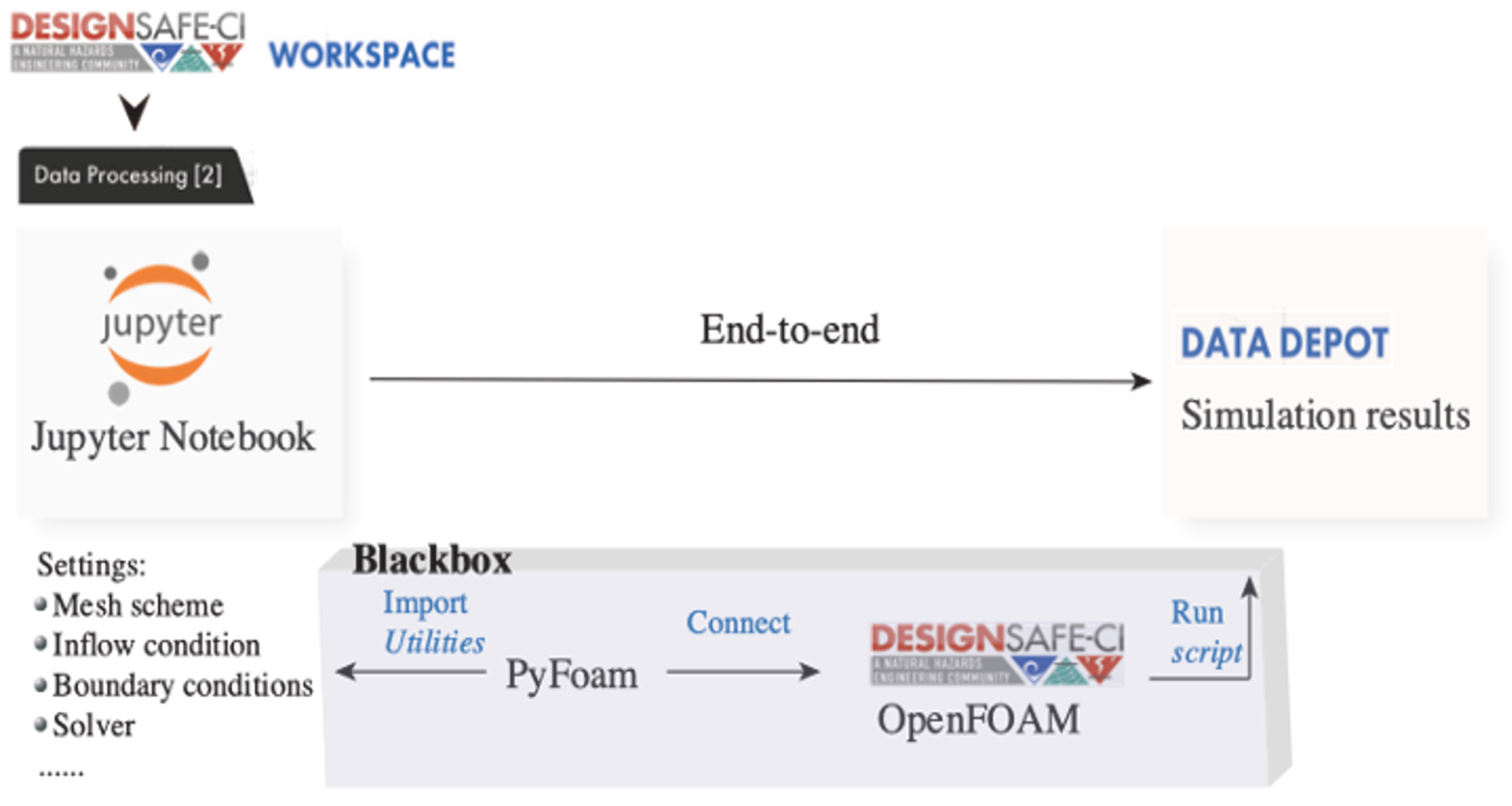
Fig. 2 Schematic of an end-to-end flow simulation implemented in the Jupyter Notebooks
Jupyter Notebook example for advanced utilities
For better understanding, A Jupyter Notebook example, Jupyter_PyFoam.ipynb, is provided that facilitates the automated CFD modeling with the aid of advanced utilities. Automated mesh generation and inflow configuration in the Jupyter Notebooks are explored through the case study of a rectangular building's cross-section. ![]()
In addition, a baseline model housed in DH_Baseline directory is provided that can be used to generate an input environment for an OpenFOAM simulation.
It is worth noting that DesignSafe recently introduced a Jupyterhub Spawner for users to run one of two Jupyter server images. To run Jupyter Notebooks for CFD presented in this document, users should use the Classic Jupyter Image as the Jupyter server.
Using PyFoam utilities in the Jupyter Notebook
At first, PyFoam and other modules should be imported into a Notebook, e.g.:
import sys
sys.path.append('/home1/apps/DesignSafe')
import PyFoam

import os, shutil, scipy.io, math, glob
import numpy as np

from pylab import *

from PyFoam.Execution.UtilityRunner import UtilityRunner
from PyFoam.Execution.BasicRunner import BasicRunner
from PyFoam.RunDictionary.SolutionDirectory import SolutionDirectory
from PyFoam.RunDictionary.SolutionFile import SolutionFile
from PyFoam.RunDictionary.BlockMesh import BlockMesh

from os import path
from subprocess import Popen
from subprocess import call
Mesh generation
To allow users to edit the dimensions of the rectangular building's cross-section, m4-scripting is employed for parameterization in OpenFOAM. To achieve it, case directories of the baseline geometry which is a square cross-section were first copied to the newly created case directories. The controlling points for mesh topology are functions of the input geometric variables. M4-scripting then manipulates the blockMeshDict dictionary, from which values of the controlling points were assigned as shown in Fig. 3.
In the end, the blockMeshDict dictionary file, which is the file for specifying the mesh parameter and used to generate a mesh in OpenFOAM, is built by executing m4-script command, e.g.,
cmd='m4 -P blockMeshDict.m4 > blockMeshDict'
pipefile = open('output', 'w')
retcode = call(cmd,shell=True,stdout=pipefile)
pipefile.close()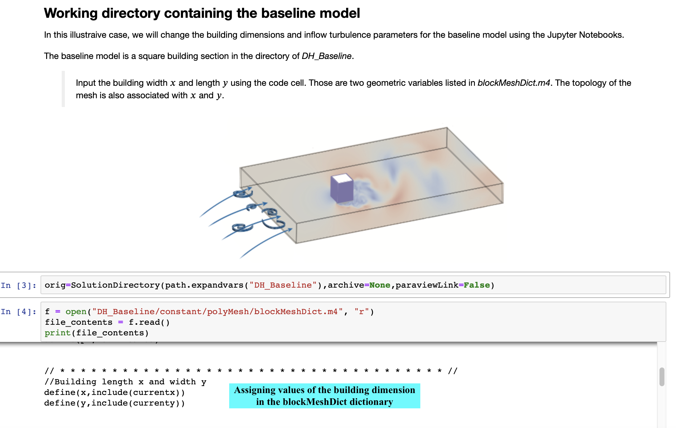
Fig. 3 Use of m4-scripting for automated mesh generation
Setup inflow condition
To edit the inflow turbulence properties based on the user's input, PyFoam is employed to set the inflow boundary conditions. In this example, k-ω SST model is selected for turbulence modeling for a demonstration, hence the two inflow turbulence parameters k and ω are modified at different inflow conditions by calling the replaceBoundary [2] utility in the PyFoam. Part of the codes is shown in the following:
from PyFoam.Execution.UtilityRunner import UtilityRunner
from PyFoam.Execution.BasicRunner import BasicRunner
from PyFoam.RunDictionary.SolutionDirectory import SolutionDirectory
from PyFoam.RunDictionary.SolutionFile import SolutionFile
### change the values k and ω at the inlet
os.chdir(case)
dire=SolutionDirectory(case,archive=None)
sol=SolutionFile(dire.initialDir(),”k”)
sol.replaceBoundary(”inlet”,”%f” %(k))
sol=SolutionFile(dire.initialDir(),”omega”)
sol.replaceBoundary(”inlet”,”%f” %(omega))
More detailed information can be found in the Jupyter_PyFoam.ipynb. The Notebook also illustrates how to prepare multiple models to simulate simultaneously and their automatic generation of input environments.
Use case of an OpenFOAM simulation with Jupyter Notebook in the DesignSafe workspace
Description
A use case example is a URANS simulation for wind flow around a rectangular building's cross-section, which is implemented at a Jupyter Notebook, OpenFOAM_Run_example.ipynb. The input environments are prepared at DH1_run directory. The test rectangular cross-section model and its mesh are shown in Fig. 4. ![]() |
|
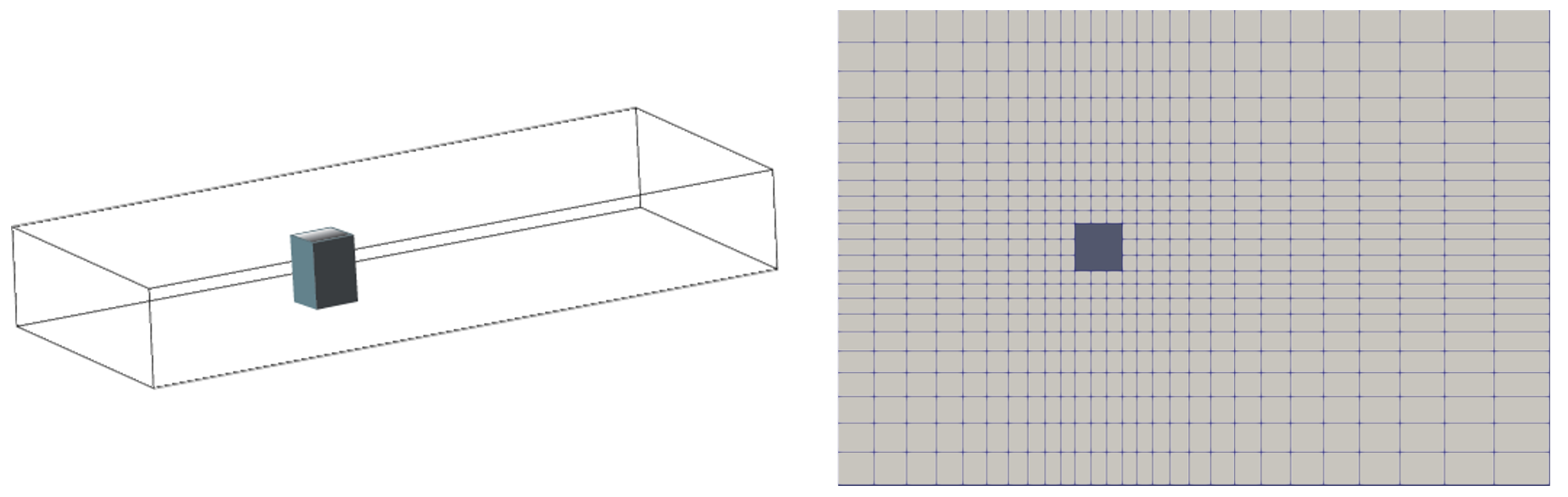
Fig. 4 Test model and its mesh
Setup agave
This script shows how to import the agave client, get the authorization (assuming that the user is already logged into DesignSafe), and access the OpenFOAM. Also
from agavepy.agave import Agave
ag = Agave.restore()
### see user profile
ag.profiles.get()
### access OpenFOAM
app = ag.apps.get(appId = 'openfoam-7.0u4')
Submit the OpenFOAM job to DesignSafe/TACC
To utilize parallel computing for faster computation, the simulation is run in the DesignSafe workspace using the Texas Advanced Computing Center (TACC) computing resources. The following script shows how to set up the OpenFOAM configuration to run, and its submission to TACC, and check the status of the submitted job [3].
### Creating job file
jobdetails = {
    # name of the job
    "name": "OpenFOAM-Demo",
    # OpenFOAM v7 is used in this use case
    "appId": "openfoam-7.0u4",
    # total run time on the cluster (max 48 hrs)
    "maxRunTime": "00:02:00",
    # the number of nodes and processors for parallel computing
    "nodeCount": 1,
    "processorsPerNode": 2,
    # simulation results will be available in the user's archive directory
    "archive": True,
    # default storage system
    "archiveSystem": "designsafe.storage.default",
    # parameters for the OpenFOAM simulation
    "parameters": {
        # running blockmesh and/or snappyHexMesh (On)
        "mesh": "On",
        # running in parallel (On) or serial (Off)
        "decomp": "On",
        # name of OpenFOAM solver: pisoFoam is used in this use case
        "solver": "pisoFoam"
    },
    "inputs": {
### directory where OpenFOAM files are stored: the path for the DH1_run directory in this use case
### check the web browser's URL at the DH1_run and use the path after "agave/" which includes one's USERNAME
### If DH1_run is located at Data depot > My Data > JupyterCFD > DH1_run, then the URL looks like:
### https://www.designsafe-ci.org/data/browser/agave/designsafe.storage.default/USERNAME/JupyterCFD/DH1_run
        "inputDirectory": "agave://designsafe.storage.default/USERNAME/JupyterCFD/DH1_run"
        }
}
### Submit the job to TACC
job = ag.jobs.submit(body=jobdetails)
### Check the job status
from agavepy.async import AgaveAsyncResponse
asrp = AgaveAsyncResponse(ag,job)
asrp.status
### if successfully submitted, then asrp.status outputs 'ACCEPTED'
Post-processing on DesignSafe
Simulation results are stored in the Data Depot in the DesignSafe and available to be post-processed by users: Data Depot > My Data > archive > jobs. To visualize the flow fields, users can utilize a visualization tool in the Tools & Application menu in the DesignSafe (Fig. 5), Paraview [4], which can read OpenFOAM files using .foam file. Fig. 6 shows an example of the post-processing of simulation results in the Paraview.
Fig. 5 Paraview software in the DesignSafe
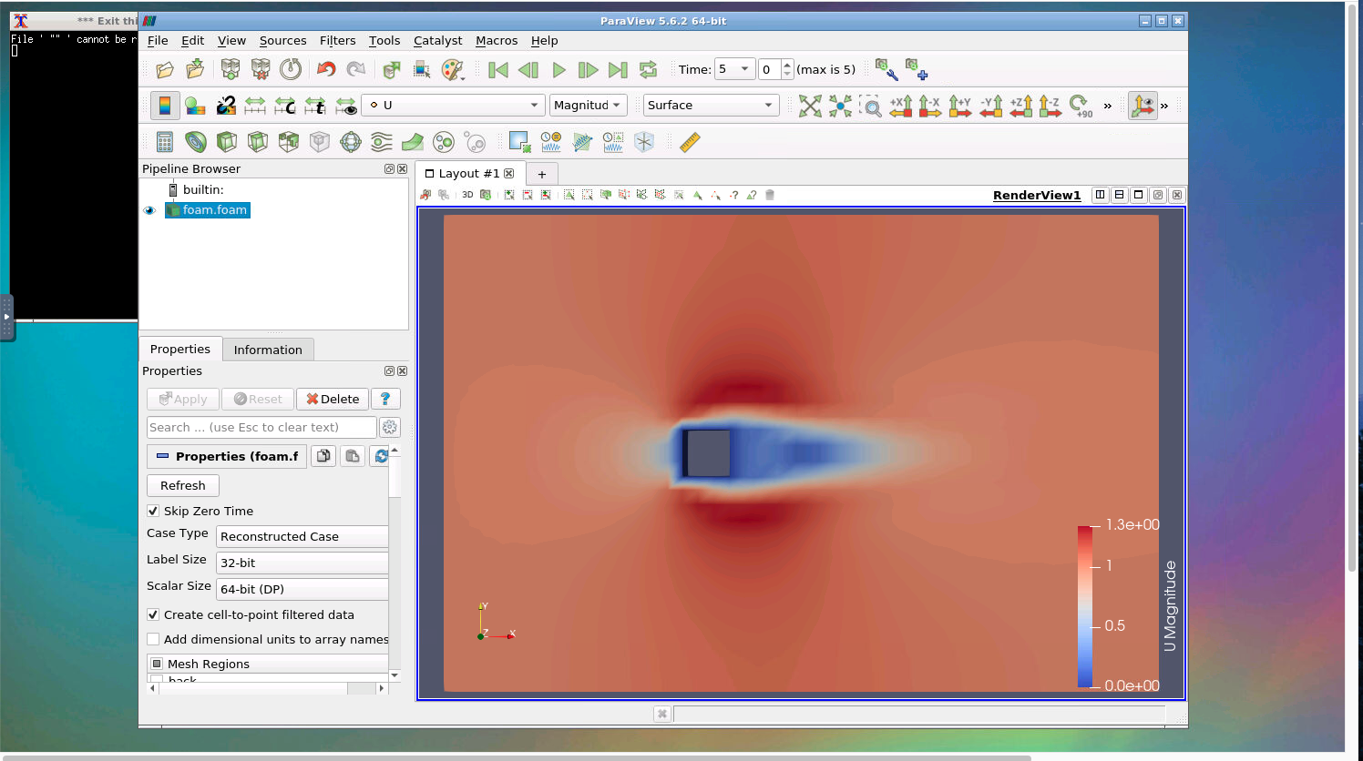
Fig. 6 Visualization of simulation results using the Paraview
For data analysis such as plotting the time series of drag or lift force coefficients, users can make a script in a Jupyter Notebook to load simulation results and make output figures using a python graphic library such as Matplotlib, etc. An example script using Matplotlib can also be found in this use case Jupyter Notebook.
References
[1] H. Jasak, A. Jemcov, Z. Tukovic, et al. OpenFOAM: A C++ library for complex physics simulations. In International workshop on coupled methods in numerical dynamics, volume 1000, pages 1-20. IUC Dubrovnik Croatia, 2007.
[2] OpenFOAM wiki. Pyfoam. https://openfoamwiki.net/index.php/Contrib/PyFoam. Online; accessed 24-Feb-2022.
[3] Harish, Ajay Bangalore; Govindjee, Sanjay; McKenna, Frank. CFD Notebook (Beginner). DesignSafe-CI, 2020.
[3] N. Vuaille. Controlling paraview from jupyter notebook. https://www.kitware.com/paraview-jupyter-notebook/. Online; accessed 24-Feb-2022.
/// html | header
## CFD Analysis of Winds on Low-Rise Building
Low-Rise Building CFD Simulations with Jupyter Notebook
///
**Ahsan Kareem - [NatHaz Modeling Laboratory](https://nathaz.nd.edu/){target=_blank}, University of Notre Dame**
Implementation of ASCE Wind Speed Profiles and User-defined Wind Speed Profiles
### Resources
#### Jupyter Notebooks
The following Jupyter notebooks are available to facilitate the analysis of each case. They are described in details in this section. You can access and run them directly on DesignSafe by clicking on the "Open in DesignSafe" button.
| Scope | Notebook |
| :-------: | :---------: |
| abcd3fg | Filename.ipynb <br> [](https://jupyter.designsafe-ci.org/hub/user-redirect/lab/tree/CommunityData/Use%20Case%20Products/OpenFOAM/PyFoam_Jupyter/Jupyter_PyFoam.ipynb) |
#### DesignSafe Resources
The following DesignSafe resources were leveraged in developing this use case.
[OpenFoam](https://www.designsafe-ci.org/rw/workspace/#!/OpenFOAM::Simulation){target=_blank}<br/>
### Background
#### Citation and Licensing
* Please cite [Ding and Kareem (2021)](https://tigerprints.clemson.edu/cgi/viewcontent.cgi?article=1025&context=aawe){target=_blank} to acknowledge the use of any resources from this use case.
* Please cite [Rathje et al. (2017)](https://doi.org/10.1061/(ASCE)NH.1527-6996.0000246){target=_blank} to acknowledge the use of DesignSafe resources.
* This software is distributed under the [GNU General Public License](https://www.gnu.org/licenses/gpl-3.0.html){target=_blank}.
### Description
This provides documentation of the workflow of generating flow around low-rise buildings exposed to ASCE-defined wind speed profiles using CFD with Jupyter Notebook. The available features of the existing Jupyter Notebook are simulations using a uniform inflow condition. In the new versions of the Notebooks inflow conditions provided by the ASCE 7 are incorporated along with two other options. One relates to user-defined inflow and the other further includes turbulent fluctuations in the inflow flowing a mean velocity profile.
The current Notebook referred to as the base case has uniform mean velocity with user-defined magnitude. It is illustrated in the following figure:

The overall workflow is described in the following schematic.

### New Features
The new features include the implementation of power-law inflow profiles in codes/standards and the introduction of the option of user-defined inflow conditions. The following Figure shows the difference between velocity profiles in the urban and suburban areas.

The wind speed profile is described as

Where the user supplies

The details from ASCE 7 are reproduced here for a quick reference.


The workflow from the OpenFOAM to Jupyter Notebook is given below. The final outcome is the velocity profile shown in the bottom right of the figure.

### Running simulation using Low-Rise Jupyter Notebook

<p align="center">Computational domain </p>
#### User define input:
1. geometry of the low-rise building’s length, width and height.
2. Inflow velocity:
Uniform velocity,
ASCE velocity profile,
Power-law velocity profile,
User-defined inflow velocity.
#### How to run it on Jupyter Notebook:
1. Install and import modules
2. CFD case of wind effect on low-rise building
* (1) Uniform inflow
* (2) ASCE inflow
* (3) Power-law inflow
* (4) User-defined inflow
3. OpenFOAM case
* (1) Brief introduction of general OpenFOAM case
* (2) Input building dimension on Jupyter Notebook

* (3) Input inflow velocity on Jupyter Notebook

4. Auto-generation of OpenFOAM case with user-defined building dimension and inflow velocity.
5. Review the generated case
6. Submit the OpenFOAM job
7. Post-processing
#### Simulation Result of desired and ASCE power law vertical profiles
{ width: "50%"}
{ width: "50%"}
#### User-Defined Profile Simulation and time histories of wind velocity fluctuations at a point


### References
[1] H. Jasak, A. Jemcov, Z. Tukovic, et al. OpenFOAM: A C++ library for complex physics simulations. In International workshop on coupled methods in numerical dynamics, volume 1000, pages 1-20. IUC Dubrovnik Croatia, 2007.<br />
[2] OpenFOAM wiki. Pyfoam. [https://openfoamwiki.net/index.php/Contrib/PyFoam](https://openfoamwiki.net/index.php/Contrib/PyFoam){target=_blank}. Online; accessed 24-Feb-2022.<br />
[3] Harish, Ajay Bangalore; Govindjee, Sanjay; McKenna, Frank. [CFD Notebook (Beginner)](https://www.designsafe-ci.org/data/browser/public/designsafe.storage.published/PRJ-2915){target=_blank}. DesignSafe-CI, 2020. <br />
<!-- END INCLUDE --> -->
/// html | header
## Tamkang Database
Tamkang Database
///
**D.K. Kwon - [NatHaz Modeling Laboratory](https://nathaz.nd.edu/){target=_blank}, University of Notre Dame**<br>
**Ahsan Kareem - [NatHaz Modeling Laboratory](https://nathaz.nd.edu/){target=_blank}, University of Notre Dame**
### Resources
#### Jupyter Notebooks
The following Jupyter notebooks are available to facilitate the analysis of each case. They are described in details in this section. You can access and run them directly on DesignSafe by clicking on the "Open in DesignSafe" button.
| Scope | Notebook |
| :-------: | :---------: |
| abcd3fg | Filename.ipynb <br> [](https://jupyter.designsafe-ci.org/hub/user-redirect/lab/tree/CommunityData/Use%20Case%20Products/OpenFOAM/PyFoam_Jupyter/Jupyter_PyFoam.ipynb) |
#### DesignSafe Resources
The following DesignSafe resources were leveraged in developing this use case.
### Background
#### Citation and Licensing
* Please cite [Rathje et al. (2017)](https://doi.org/10.1061/(ASCE)NH.1527-6996.0000246){target=_blank} to acknowledge the use of DesignSafe resources.
* This software is distributed under the [GNU General Public License](https://www.gnu.org/licenses/gpl-3.0.html){target=_blank}.
### Description
Currently, the DesignSafe platform offers through [VORTEX-Winds](http://www.vortex-winds.org/): Database-Enabled Design Module for High-Rise ([DEDM-HR](http://evovw.ce.nd.edu/dadm/VW_design6_noauth1.html)). The web-enabled application developed by the NatHaz Modeling Laboratory, University of Notre Dame seamlessly pools databases of multiple high-frequency base balance measurements through wind tunnel tests/experiments from geographically dispersed locations and merges them to expand the number of available building configurations for preliminary design under winds. It houses two aerodynamic load databases from the NatHaz Modeling Laboratory and the Wind Engineering Research Center, Tamkang University (TKU-WERC), Taiwan. The Tamkang data is accessed automatically when using the DEDM-HR and users do not have any access to the data itself. To offer direct access to the data contributed by Tamkang University and for archival purposes, we have provided a Microsoft Excel spreadsheet that contains the data for the buildings available in their data along with a tab for explaining the nomenclature and the data layout which details all the captions for the data, their symbols, and units, etc. <br>
For the Tamkang database that was established via high frequency base balance tests, one can find the information on how to use them in our previous publications (e.g., Zhou et al. 2003; Kwon et al. 2006). The NatHaz database consists of 7 cross-sectional shapes, 3 heights, 2 exposure categories, and 3-dimensional loading, i.e., in the alongwind, acrosswind, and torsional directions for each shape. The two exposure conditions in the NatHaz database are open (α = 0.16, where α = power law exponent of the mean wind velocity profile) and urban (α = 0.35), similar to the conditions of Exposure C in the ASCE 7-05 and 7- 10 (open) and Exposure A in ASCE 7-98 (urban), respectively. On the other hand, the Tamkang database consists of 13 shapes, 5 heights, and 3-dimensional loading for each shape. The Tamkang database has three exposures, i.e., open (α = 0.15), suburban (α = 0.25), and urban (α = 0.32), which are close to Exposures C, B, and A as defined in the ASCE standard (ASCE 7-98), respectively. Although both the NatHaz and Tamkang databases have two common terrain conditions (Exposure A and C), the latter has a greater subdivision in the data sets, i.e., an additional terrain condition (Exposure B) and more test cases in shapes and heights, as shown in Table 1 for the overall side ratio (D/B) and aspect ratios (H/√BD) for both databases. The databases mainly consist of non-dimensional power spectral density [C_M (f)] and RMS base moment/torque coefficients (σCM) in three directions for each data set, which are utilized for estimating responses based on the theoretical approach (Zhou et al. 2003; Kwon et al. 2006). Detailed descriptions of the data sets and wind tunnel test conditions can be found in Kareem (1990), Kijewski and Kareem (1998), Zhou et al. (2003), Cheng and Wang (2004), and Cheng et al. (2007).<br>
The reliability of the measured spectra in the databases has been established through verifications against data sets from other wind tunnel experiments (Kareem, 1990; Zhou et al., 2003; Lin et al., 2005; Kwon et al., 2008; Kwon et al. 2014). In these studies, it was demonstrated that the NatHaz and Tamkang databases were in close agreement with the exception of a few cases. Some discrepancies in the response estimates may be attributed to slight differences in the inflow conditions at different wind tunnels, which are inevitable and to which the associated loads may be quite sensitive. Thus, such spectral comparisons are not further investigated here.
Table 1. Datasets in NatHaz and Tamkang databases
| SR<sup>1)</sup> | 0.20 | 0.25 | 0.33 | 0.40 | 0.50 | 0.67 | 1.00 | 1.50 | 2.00 | 2.50 | 3.00 | 4.00 | 5.00 |
|:---:|:---:|:---:|:---:|:---:|:---:|:---:|:---:|:---:|:---:|:---:|:---:|:---:|:---:|
| NatHaz | – | – | O | – | O | O | O | O | O | – | O | – | – |
| NatHaz AR<sup>2)</sup> | – | – | 4.62 5.77 6.93 | – | 3.77 4.71 5.66 | 3.27 4.08 4.90 | 4.00 5.00 6.00 | 3.27 4.08 4.90 | 3.77 4.71 5.66 | – | 4.62 5.77 6.93 | – | – |
| Tamkang | O | O | O | O | O | O | O | O | O | O | O | O | O |
| Tamkang AR<sup>3)</sup> | 3~7 | 3~7 | 3~7 | 3~7 | 3~7 | 3~7 | 3~7 | 3~7 | 3~7 | 3~7 | 3~7 | 3~7 | 3~7 |
1)SR = side ratio (D/B); 2)AR = aspect ratio (H/√BD); 3)ARs in the Tamkang database are 3, 4, 5, 6, and 7 for all SRs; Symbols ‘O’ and ‘–’ = presence and absence of datasets in each database, respectively.
### References
[1] Cheng, C. M. and Wang, J. (2004). “Wind tunnel database for an intermediate wind resistance design of tall buildings.” Proc. 1st International Symposium on Wind Effects on Buildings and Urban Environment, Tokyo Polytechnic, University, Tokyo, Japan.<br>
[2] Cheng, C. M., Lin, Y. Y., Wang, J., Wu, J. C. and Chang, C. H. (2007). “The aerodynamic database for the interference effects of adjacent tall buildings.” Proc. 12th International Conference on Wind Engineering, Cairns, Australia, 359-366.<br>
[3] Kareem A. (1990). “Measurement of pressure and force fields on building models in simulated atmospheric flows.” Journal of Wind Engineering and Industrial Aerodynamics, 36(1), 589-599.<br>
[4] Kijewski, T. and Kareem, A. (1998). “Dynamic wind effects: a comparative study of provisions in codes and standards with wind tunnel data.” Wind and Structures, 1(1), 77-109.<br>
[5] Kwon, D., Kijewski-Correa, T. and Kareem, A. (2008). “e-analysis of high-rise buildings subjected to wind loads.” Journal of Structural Engineering, ASCE, 134(7), 1139-1153.<br>
[6] Kwon, D. K., and Kareem, A., (2013). “A multiple database-enabled design module with embedded features of international codes and standards,” International Journal of High-Rise Buildings, 2(3), 257-269.<br>
[7] Kwon, D. K., Spence, S. M. J. and Kareem, A. (2014). “Performance evaluation of database-enabled design frameworks for the preliminary design of tall buildings." Journal of Structural Engineering, ASCE, 141(10), 04014242-1.<br>
[8] Zhou, Y., Kijewski, T. and Kareem, A. (2003). “Aerodynamic loads on tall buildings: Interactive database.” Journal of Structural Engineering, ASCE, 129(3), 394-404.<br>
<!-- END INCLUDE --> -->
Visualizing Surge for Regional Risks
Integration of QGIS and Python Scripts to Model and Visualize Storm Impacts on Distributed Infrastructure Systems
Catalina González-Dueñas and Jamie E. Padgett - Rice University
Miku Fukatsu - Tokyo University of Science
This use case study shows how to automate the extraction of storm intensity parameters at the structure level to support regional risk assessment studies. This example leverages QGIS and python scripts to obtain the surge elevation and significant wave height from multiple storms at specific building locations. The case study also shows how to visualize the outputs in QGIS and export them as a web map.
Resources
Jupyter Notebooks
The following Jupyter notebooks are available to facilitate the analysis of each case. They are described in details in this section. You can access and run them directly on DesignSafe by clicking on the "Open in DesignSafe" button.
| Scope | Notebook |
|---|---|
| Read Surge | Surge_Galv.ipynb |
| Read Wave | Wave_Galv.ipynb |
DesignSafe Resources
The following DesignSafe resources are leveraged in this example:
Geospatial data analysis and Visualization on DS - QGIS
Jupyter notebooks on DS Jupyterhub
Background
Citation and Licensing
-
Please cite González-Dueñas and Padgett (2022) to acknowledge the use of any resources from this use case.
-
Please cite Rathje et al. (2017) to acknowledge the use of DesignSafe resources.
-
This software is distributed under the GNU General Public License.
Description
This case study aims to support pre-data processing workflows for machine learning applications and regional risk analysis. When developing predictive or surrogate models for the response of distributed infrastructure and structural systems, intensity measures (IMs) need to be associated with each component of the system (e.g., buildings, bridges, roads) under varying hazard intensity or different hazard scenarios. To accomplish this and given the different resolutions of the hazard and infrastructure data, geographical tools need to be used to associate the intensity measures with the distributed infrastructure or portfolio components. In this case study, python codes were developed to automate geospatial analysis and visualization tasks using QGIS.
This case study is divided into four basic components:
- Introduction and workflow of analysis
- Storm data analysis using Jupyter notebooks
- Geospatial analysis via QGIS
- Visualization of the outputs
Introduction and workflow of analysis
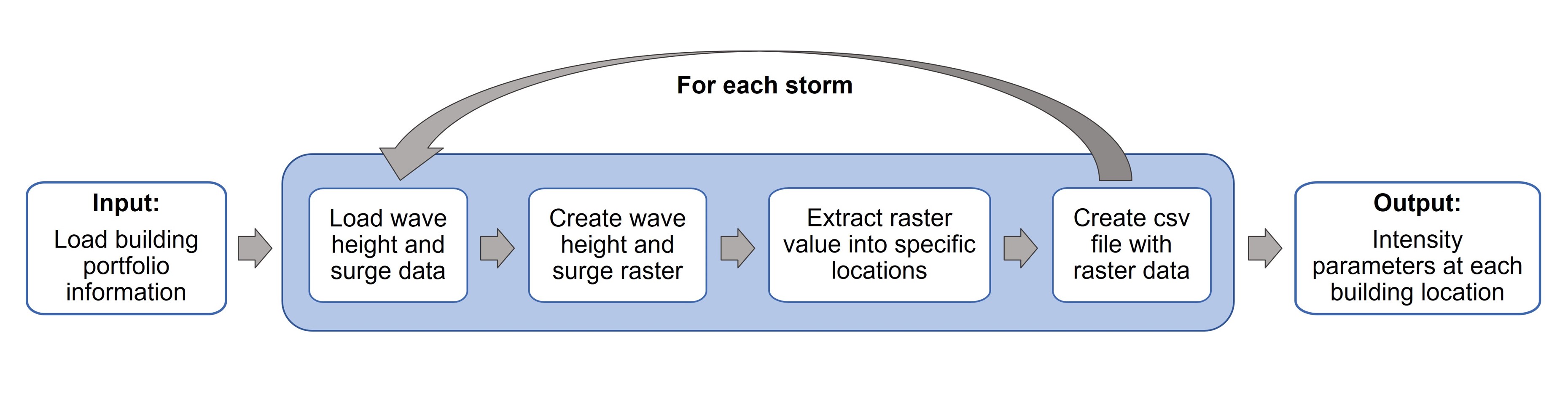
In this example, the automated procedure to extract intensity measures is leveraged to obtain the maximum surge elevation and significant wave height at specific house locations for different storm scenarios. The surge elevation and the significant wave height are important parameters when evaluating the structural performance of houses under hurricane loads, and have been used to formulate different building fragility functions (e.g., Tomiczek, Kennedy, and Rogers (2014); Nofal et al. (2021)){target=_blank}. As a proof of concept, the intensity measures (i.e., surge elevation and significant wave height) will be extracted for 3 different storms using the building portfolio of Galveston Island, Texas. The storms correspond to synthetic variations of storm FEMA 33, a probabilistic storm approximately equivalent to a 100-year return period storm in the Houston-Galveston region. The storms are simulated using ADCIC+SWAN numerical models of storm FEMA33, with varying forward storm velocity and sea-level rise. For more details on the storm definition, the user can refer to Ebad et al. (2020) and González-Dueñas and Padgett (2021).
In order to relate the storm data to the building portfolio data, it is necessary to convert the storm outputs to a surface data and then extract at the locations of interest. First, the output files from the ADCIRC+SWAN simulation corresponding to the surge elevation (file fort.63.nc) and significant wave height (file swan_HS.63.nc) need to be converted to a format that can be exported to a GIS (Geographical Information System) software. This pre-processing of the storm data provides the surge elevation and significant wave height in each of the grid points used to define the computational domain of the simulation in a vector data format. Since these points (i.e., ADCIRC+SWAN grid) have a different spatial resolution than the infrastructure system under analysis (i.e., building locations), the storm outputs are converted to a surface data format and then the value at each building location is extracted from it. This is repeated for each one of the storms under analysis and then the ouput data (IMs at each building location) is exported as a csv file. This file is used to support further analysis in the context of risk assessment or machine learning applications, as predictors or response of a system. The workflow of analysis is as follows:
Storm data analysis using Jupyter notebooks
To read the ADCIRC+SWAN storm simulation outputs, two Jupyter notebooks are provided, which can extract the maximum surge elevation and significant wave height values within a particular region. The Read_Surge Jupyter notebook takes as an input the fort.63.nc ADCIRC+SWAN output file and provides a csv file with the maximum surge elevation value at each of the points within the region specified by the user. Specifying a region helps to reduce the computational time and to provide the outputs only on the region of interest for the user. Similarly, the Read_WaveHS Jupyter notebook, reads the swan_HS.63.nc file and provides the maximum significant wave height in the grid points of the specified area. Direct links to the Notebooks are provided above.
To use the Jupyter notebooks, the user must:
- Create a new folder in My data and copy the Jupyter notebooks from the Community Data folder
- Ensure that the fort.63.nc and swan_HS.63.nc are located in the same folder as the Jupyer notebooks
- Change the coordinates of the area of interest in [6]:
### Example of a polygon that contains Galveston Island, TX (The coordinates can be obtained from Google maps)
polygon = Polygon([(-95.20669, 29.12035), (-95.14008, 29.04294), (-94.67968, 29.35433), (-94.75487, 29.41924), (-95.20669, 29.12035)])### In this example, the output name of the csv surge elevation file is "surge_max"
with open('surge_max.csv','w') as f1:Geospatial analysis via QGIS
Opening a QGIS session in DesignSafe
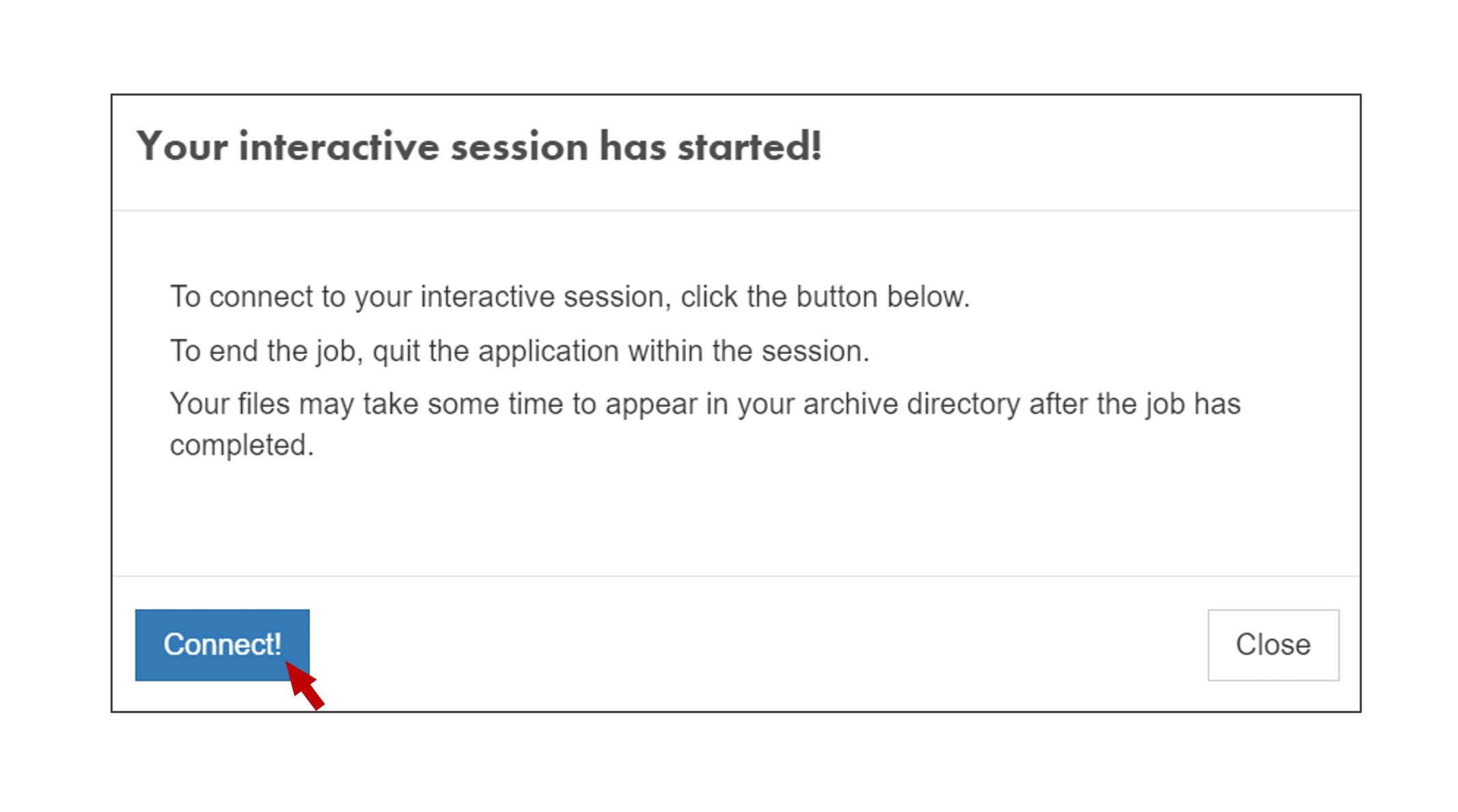
To access QGIS via DesignSafe go to Workspace -> Tools & Applications -> Visualization -> QGIS Desktop 3.16. You will be prompted the following window:
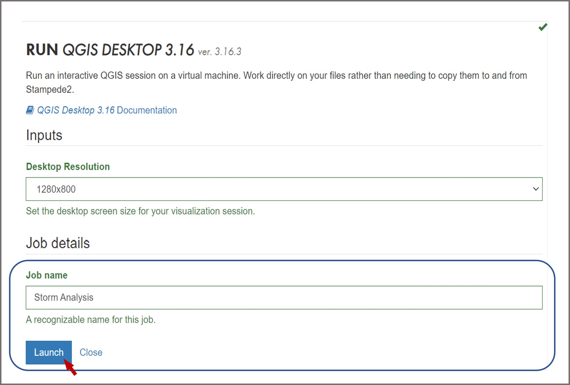
Change the desktop resolution according to your screen size preferences, provide a name for your job, and hit Launch when you finish. After a couple of minutes your interactive session will start, click Connect:
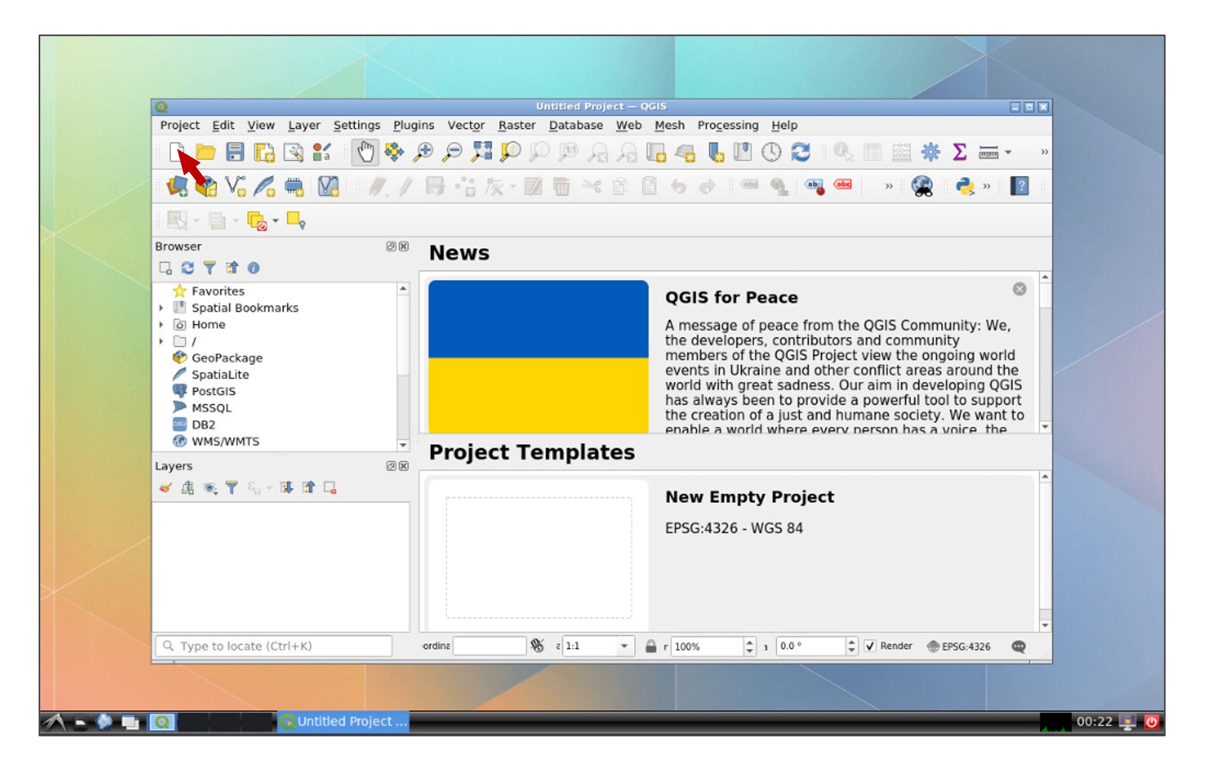
You will be directed to an interactive QGIS session, create a new project by clicking the New Project icon or press Ctrl+N:
Modify user inputs and run the python script
A python script called IM_Extract is provided to extract the desired IMs at specific locations. Follow these steps to use this code:
- Create a folder to store the outputs of the analysis in your My data folder in DS
- Provide a csv file that specifies the points for which you wish to obtain the intensity measures. This file should be in the following format (see the Complete_Building_Data file for an example of the building stock of Galveston Island, TX): a. The first column should contain an ID (e.g., number of the row) b. The second column corresponds to the longitude of each location c. The third column corresponds to the latitude of each location
- Create a folder named Storms in which you will store the data fromt the different storms
- Within the Storms folder, create a folder for each one of the storms you wish to analyze. Each folder should contain the output csv files from the ADCIRC+SWAN simulations (e.g., surge_max.csv, wave_H_max.csv). In our case study, we will use three different storms.
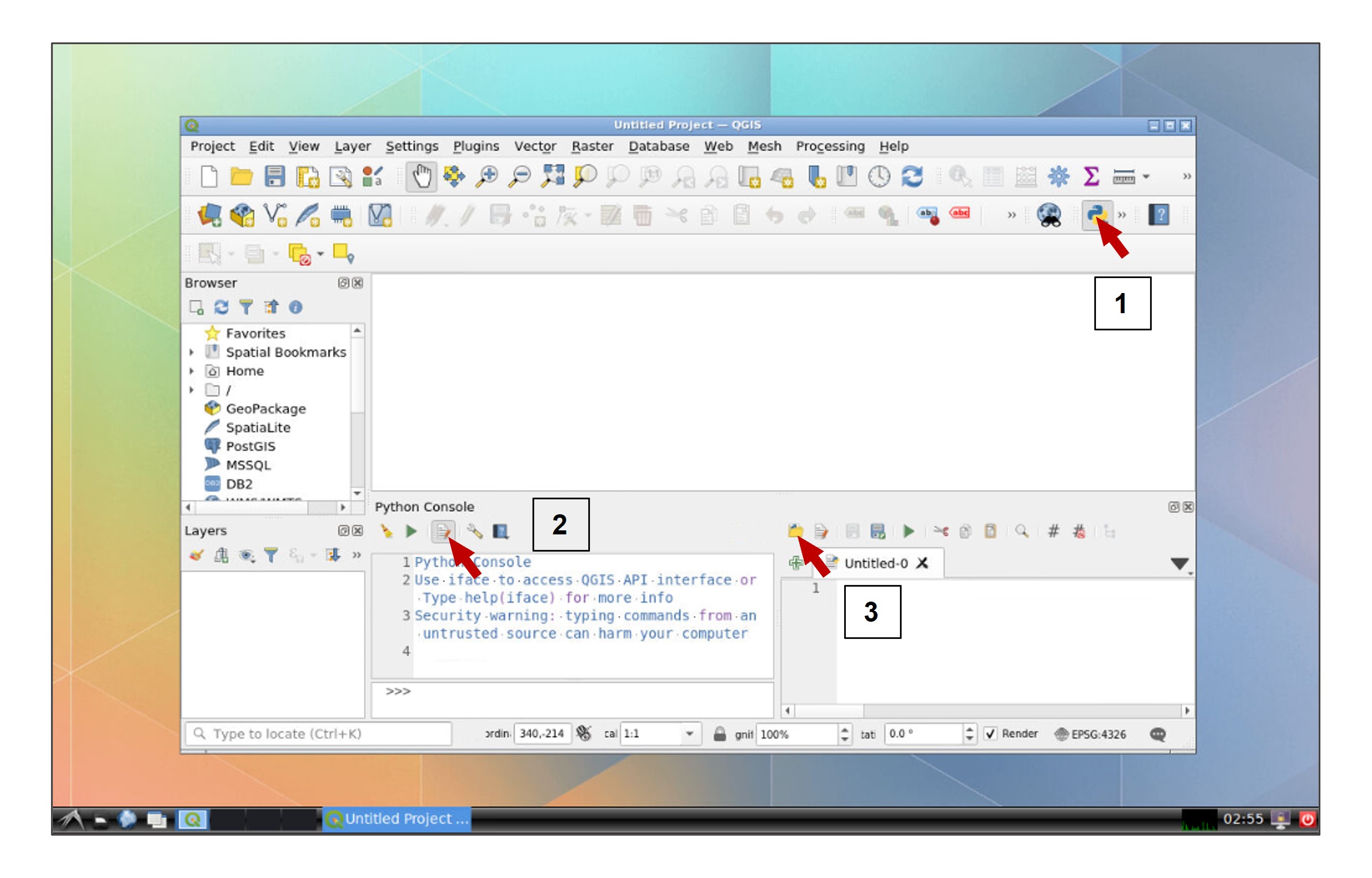
Once the folder of analysis is created in your Data Depot, we can proceed to perform the geospatial analysis in QGIS. Open the python console within QGIS, click the Show Editor button, and then click Open Script:
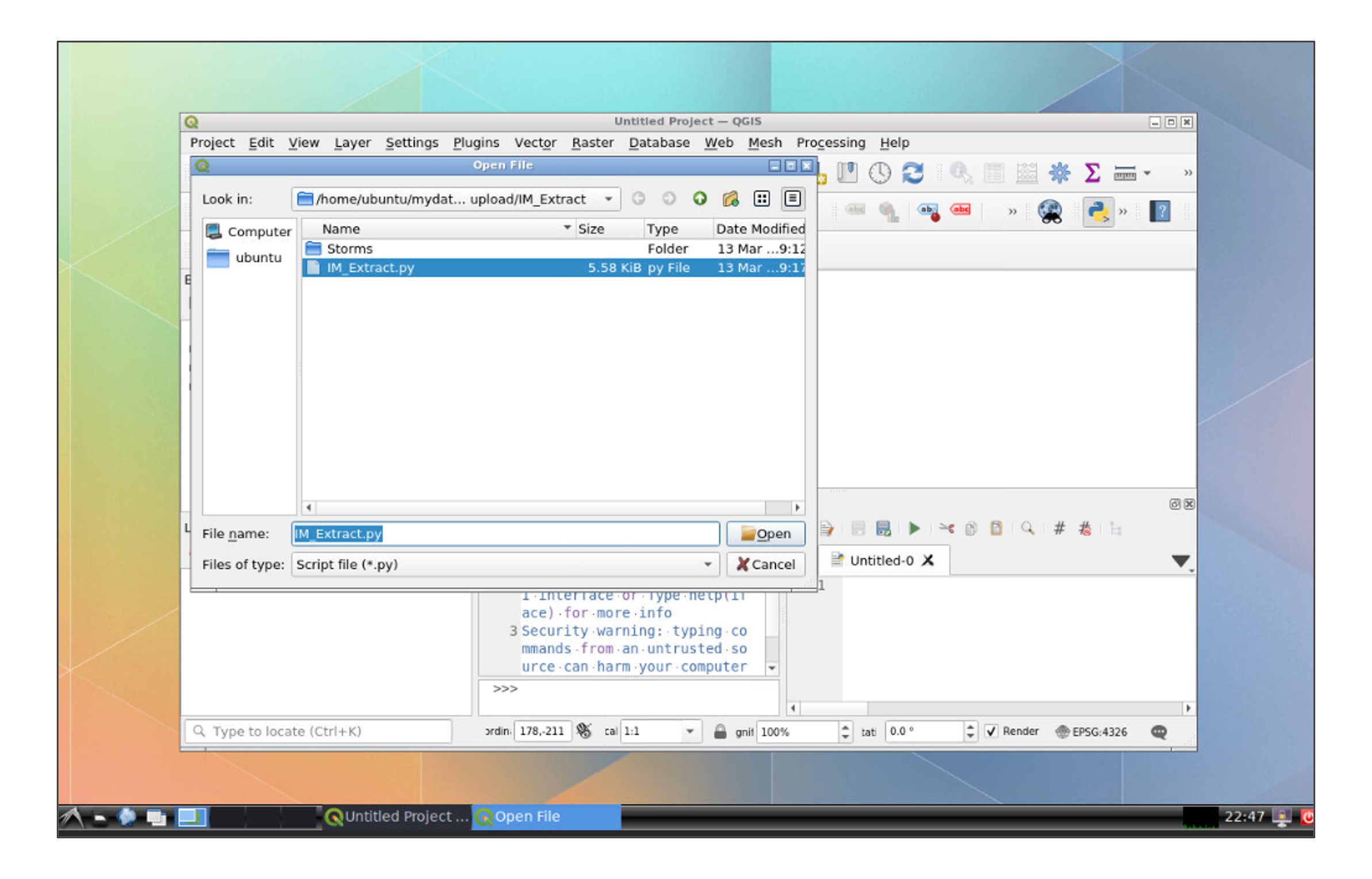
In the file explorer, go to your data folder and open the IM_Extract script:
Modify the path of the folder for your own data folder in line 17:
path= r"/home/ubuntu/mydata/**name of your folder**"### Line 22
# 2. Change cell size (defalt is 0.001)
cell_size = 0.001
### Line 75
# Interpolation method
alg = "qgis:tininterpolation"Once you finish the modifications, click Run Script.
Visualization of the outputs
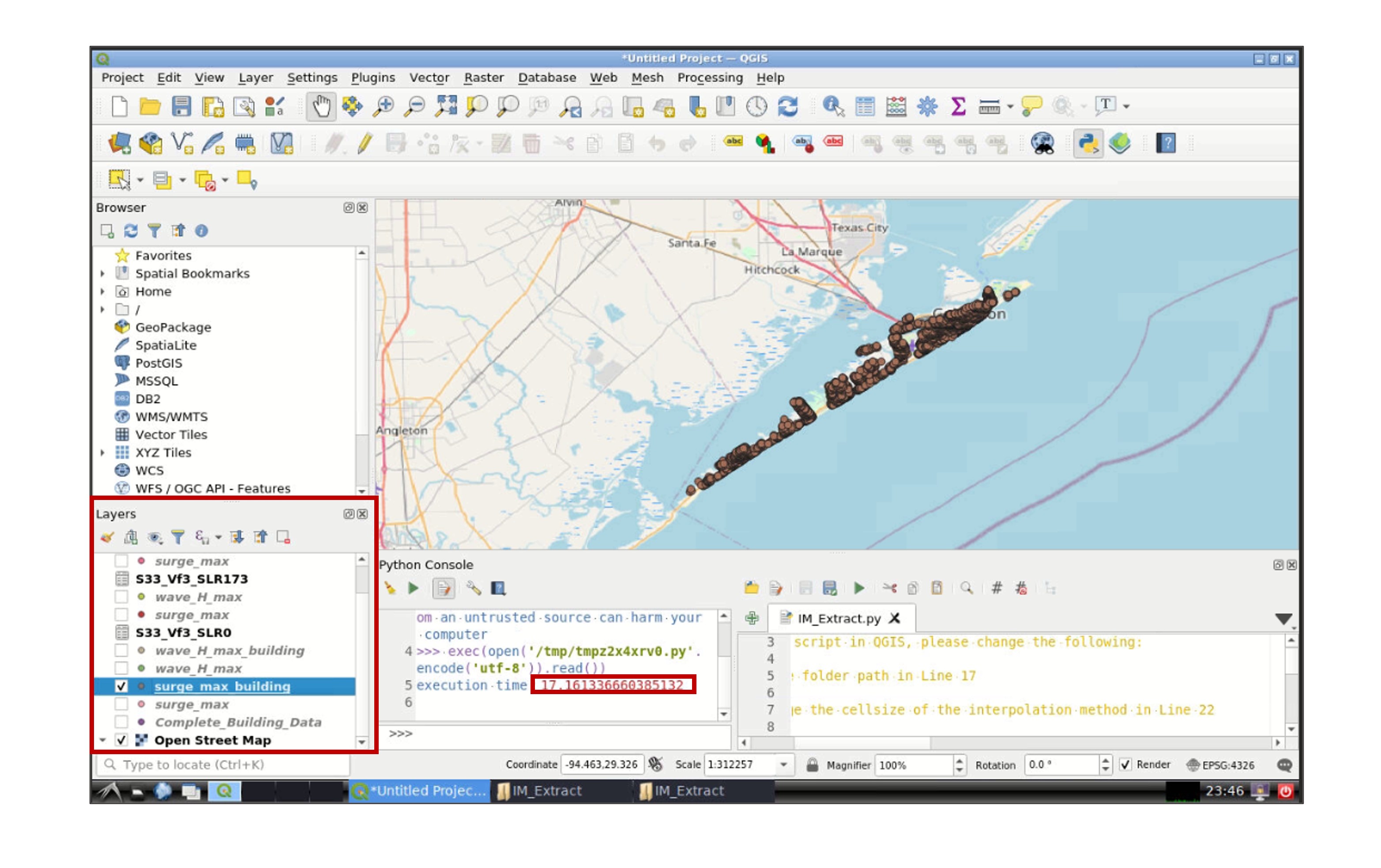
Once the script finish running, the time taken to run the script will appear in the python console and the layers created in the analysis will be displayed in the Layers section (left-bottom window) in QGIS:
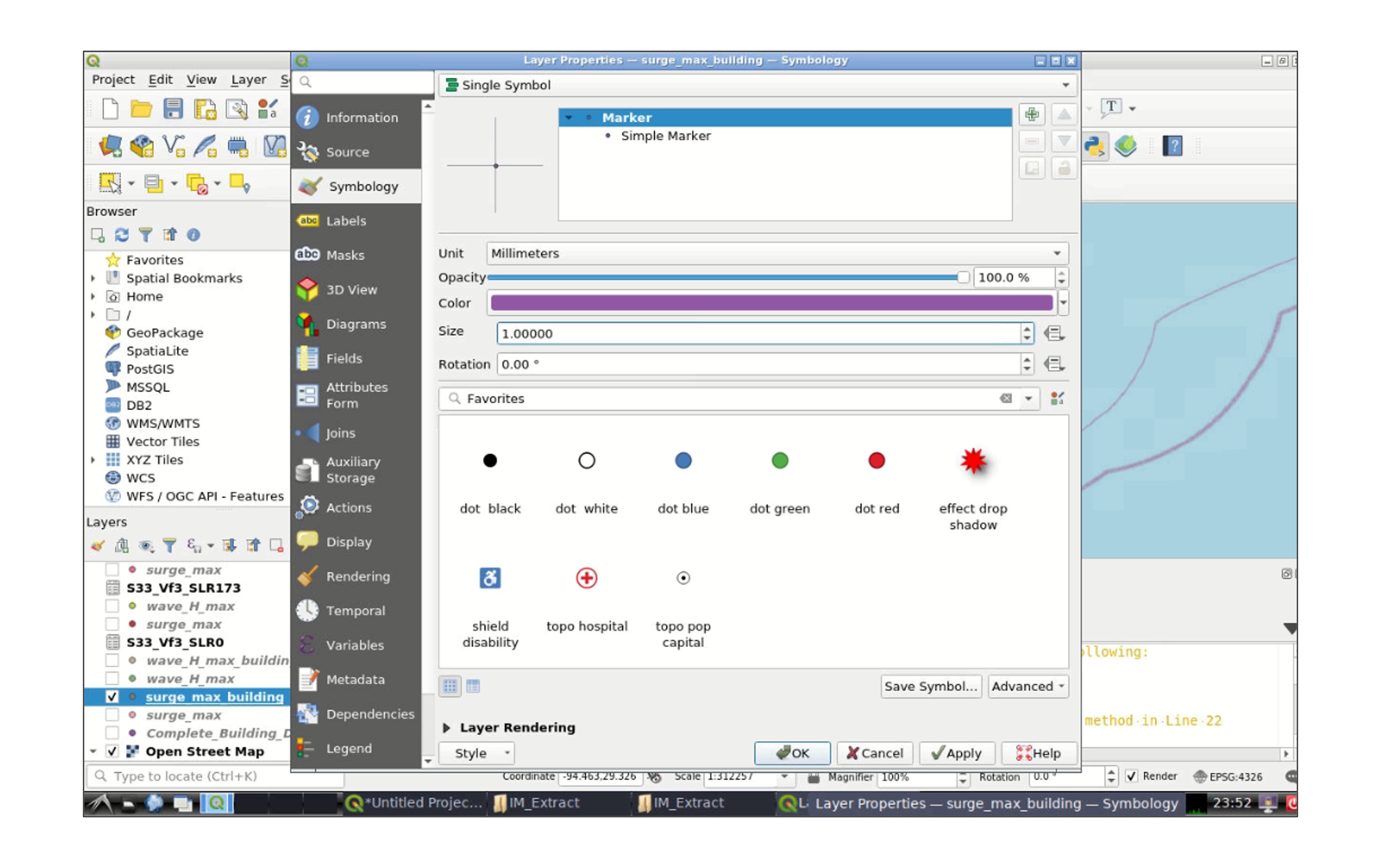
Right click one of the layers, and go to Properties -> Symbology to modify the appearance of the layer (e.g., color, size of the symbol):
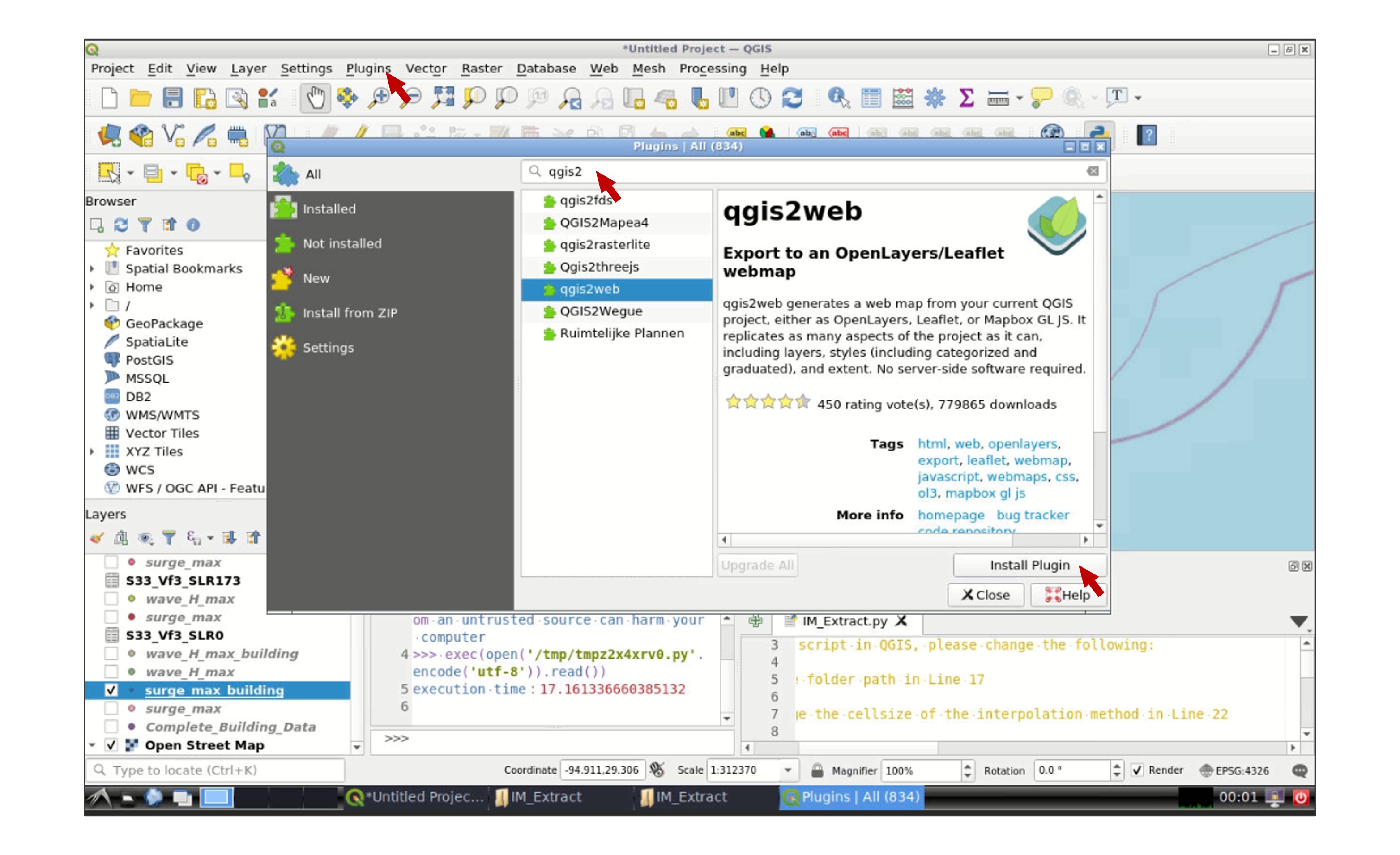
Click OK when you finish the modifications. You will be directed to the main window again, go to the the toolbar and click Plugins -> Manage and Install Plugins. In the search tab type qgis2web, select the plugin, and click Install Plugin:
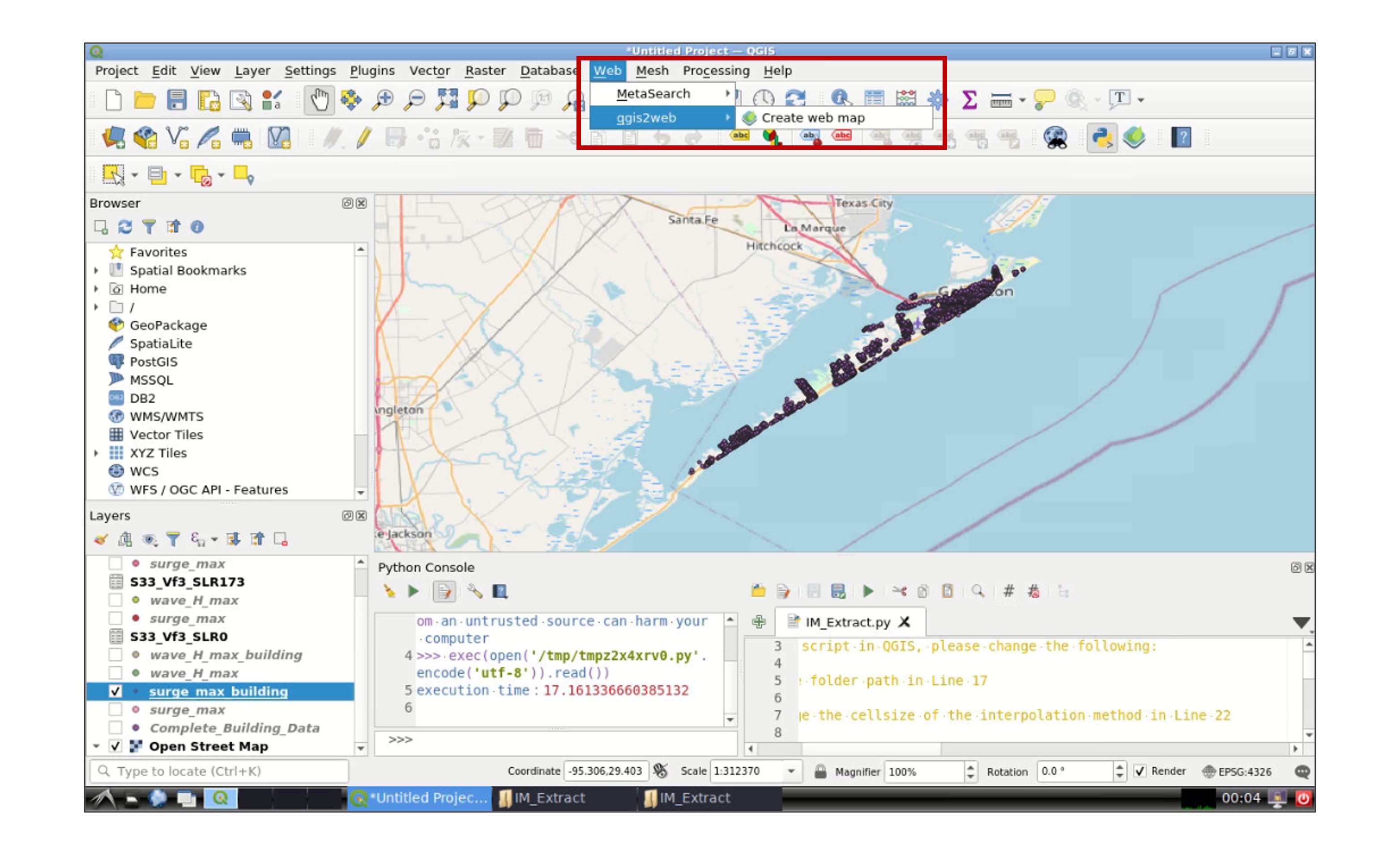
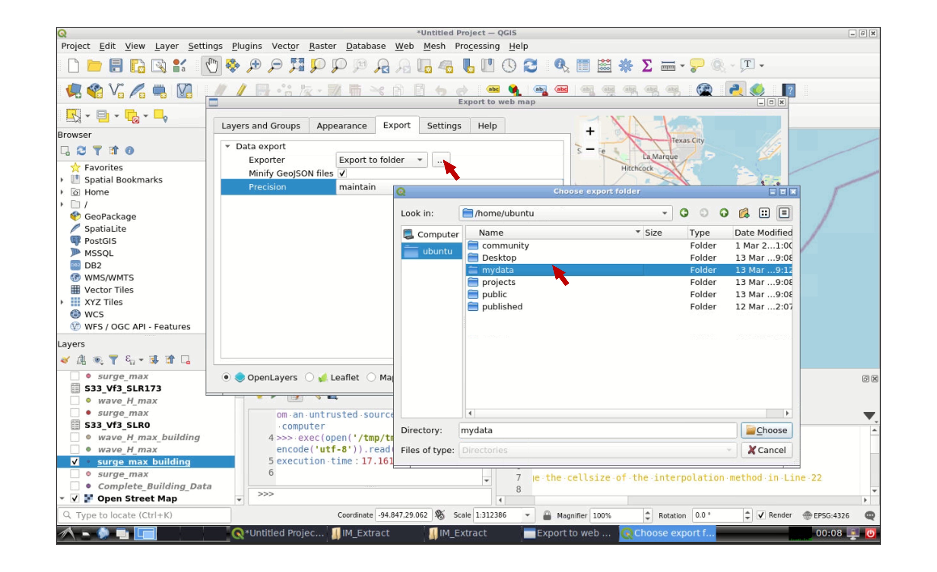
Go to Web -> qgis2web -> Create web map:
In the new window, select the layer(s) that you wish to export in the Layers and Groups tab, and modify the appearance of the map in the Appearance tab. Then go to the Export tab and click in the icon next to Export to folder and select your working data folder:
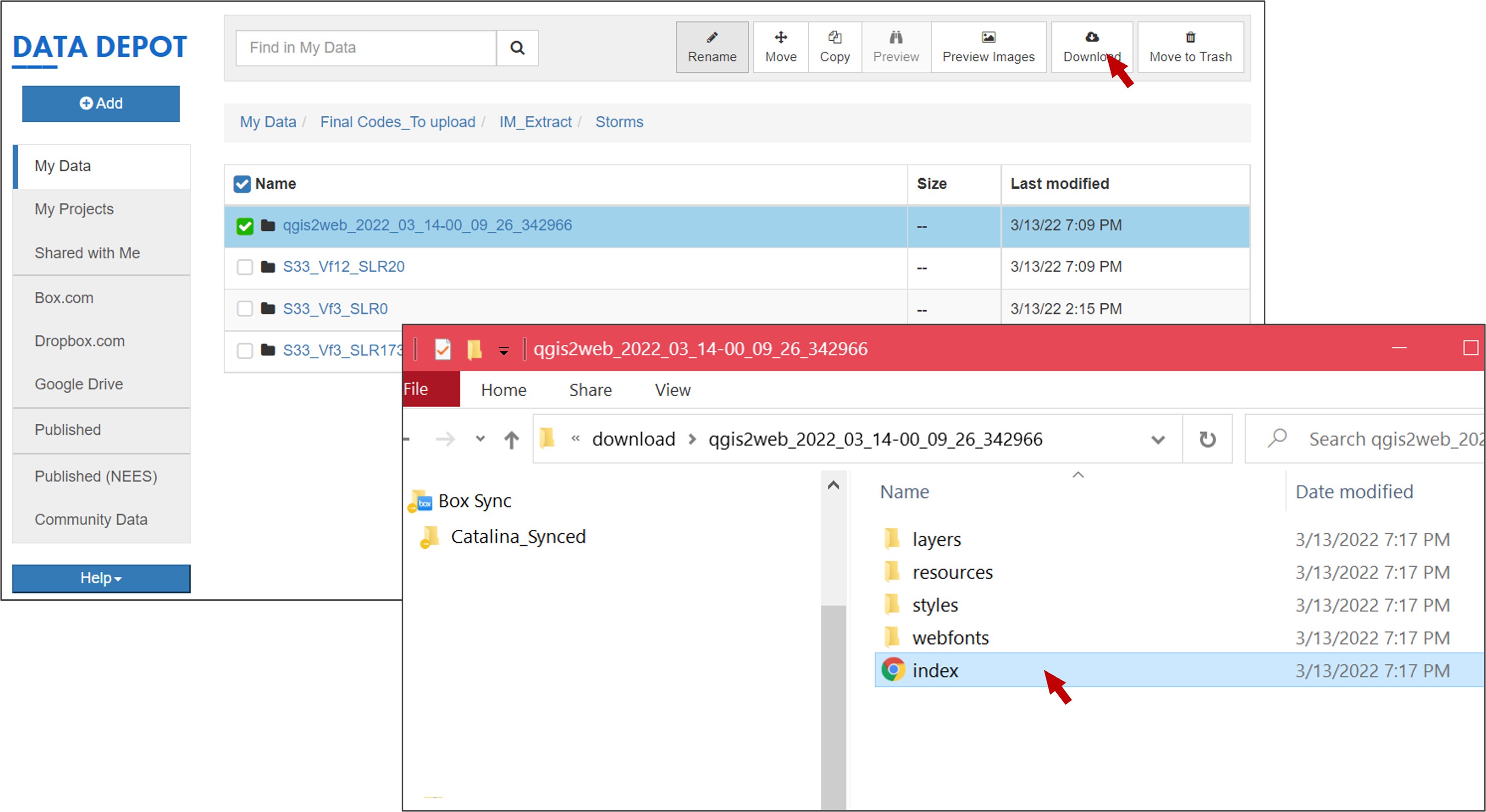
Once you finish, a new web explorer window will open in your interactive session with the exported QGIS map:
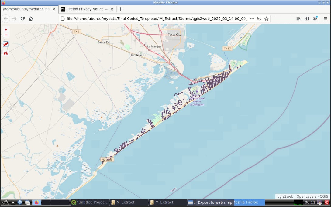
Go to your working folder in the Data Depot, a new folder containing the web map will be created. You can download the folder and double click Index, the web map you created will be displayed in the web explorer of your local computer: